

Initial Summary
Conference websites occupy a peculiar position in academic infrastructure: they are critical for a few months, heavily trafficked by a specific audience, and then abandoned once the event concludes. This temporary but high-stakes nature means that most conference websites fail in predictable ways: they prioritize visual appeal over information accessibility, bury critical details under multiple navigation layers, and assume visitors will tolerate poor mobile experiences because the desktop site looks professional. The best conference websites do the opposite. They recognize that potential attendees arrive with specific questions (When is it? Where is it? Can I afford it? Should I submit?), want answers immediately, and will leave for a competitor conference if those answers aren't obvious. This guide examines the structural, content, and technical patterns that make conference websites genuinely useful rather than merely decorative.
What a Conference Website Must Do
Before examining specific design patterns, it's necessary to establish what conference websites actually accomplish, because the stated purpose (promoting the conference) obscures the functional purpose. A conference website serves three distinct audiences with different information needs, and most sites optimize for the wrong one.
Audience 1: Potential attendees deciding whether to come. They need: dates, location, topic/theme, expected attendance size, registration cost, and whether the conference is worth their time (speaker quality, previous editions' success).
Audience 2: Committed attendees looking for specific information. They need: submission deadlines, registration links, hotel blocks, venue details, schedule, accepted papers list, travel information.
Audience 3: Organizers and sponsors seeking legitimacy signals. They need: organizing committee prominence, sponsor logos, academic affiliations, institutional backing.
Most conference websites prioritize Audience 3 (making the conference look prestigious) at the expense of Audiences 1 and 2 (helping people decide whether to attend and then actually attend). The result is a homepage dominated by sponsor logos and glamorous venue photos, while the submission deadline is buried three clicks deep.
Key Insight: A conference website's primary job is reducing the cognitive work required to answer the question 'Should I attend, and if so, what do I need to do?'. Every design decision should be evaluated against this criterion. If a visitor cannot determine within 10 seconds whether the conference is relevant to them and worth attending, the website has failed.
Pattern 1: Critical Information Above the Fold
The single most important pattern for conference websites is placing four pieces of information in the hero section (the first screen visitors see without scrolling): conference name and topic, dates, location, and registration/submission call-to-action.
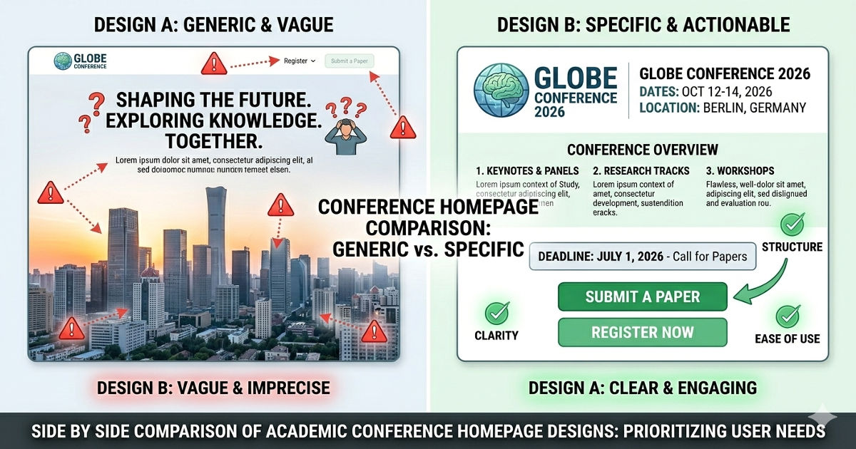
The Wrong Approach: Aesthetic Priority
A conference homepage opens with a full-screen image of the venue city, the conference name in elegant typography, and a tagline: 'Advancing the frontiers of knowledge'. Dates appear in small text at the bottom. Location requires clicking 'Venue'. Registration is under a 'Participate' dropdown. A visitor interested in submitting a paper must explore the site to determine if submission deadlines have passed.
The Right Approach: Information Priority
The same conference opens with the conference name, 'September 15-18, 2026 | Singapore', and two prominent buttons: 'Submit a Paper' and 'Register to Attend'. Below this, a single sentence describes the conference topic: 'Annual Meeting on Energy Systems'. The visitor knows immediately whether this conference is relevant, whether they can attend, and what action to take next.
Implementation rule: The hero section must answer: What is this conference about? When is it? Where is it? What should I do next? These four elements should be readable without scrolling on desktop and mobile.
Pattern 2: Deadline Prominence Over Committee Bios
Academic conference websites routinely dedicate significant homepage space to organizing committee headshots and bios, while placing submission deadlines in a sidebar or separate page. This prioritization inverts actual user needs: potential submitters need deadlines immediately; they don't need committee bios until after deciding to submit.
The Cost of Buried Deadlines
A researcher visits a conference site on March 1st to determine if they can submit work. The submission deadline was February 28th, but this information appears only on the 'Call for Papers' page, which the visitor must actively navigate to. They leave, assuming they missed the deadline, when in reality the organizers extended it to March 15th but only announced the extension on Twitter.
The Better Approach
The homepage includes a 'Key Dates' section immediately below the hero, listing: Abstract submission deadline, Full paper deadline, Notification date, Registration deadline, Conference dates. Each date includes a countdown ('23 days remaining') if the deadline is upcoming. Committee information appears on a separate 'About' or 'Organization' page.
Implementation rule: All deadlines should be visible on the homepage with countdown timers if appropriate. Committee information belongs on a dedicated subpage, not the homepage.
Pattern 3: Registration Clarity, Not Registration Games
Conference registration often involves complex pricing: early bird rates, student rates, member rates, non-member rates, virtual attendance rates. Many conference websites present this information in dense tables that require cross-referencing multiple columns. This complexity is real, but the presentation doesn't need to add additional cognitive load.
Poor Registration Design
The registration page shows a table with seven rows (member types) and five columns (registration tier deadlines), requiring visitors to locate their cell in the matrix. Additional fees for workshops, banquets, and proceedings appear in separate sections below the table. A visitor must calculate their total cost manually.
Clear Registration Design
The registration page opens with a clear heading: 'What type of attendee are you?' followed by simple categories: Faculty/Industry Professional, Postdoc/Student, Virtual Attendee. Selecting one reveals pricing specific to that category, with current applicable rates highlighted and future rate increases shown with dates. Optional add-ons (workshops, banquet) appear as checkboxes with clear pricing.
Implementation rule: Structure registration information as a decision tree (What describes you? → Here's your price) rather than a comprehensive table requiring manual lookup.
Pattern 4: Mobile-First Design for Schedule Access
During the conference itself, attendees access the schedule primarily on mobile devices while moving between sessions. Conference websites that display schedules as large multi-column desktop tables fail this use case entirely; the table is unreadable on mobile, requires zooming and horizontal scrolling, and makes it impossible to quickly find your next session.
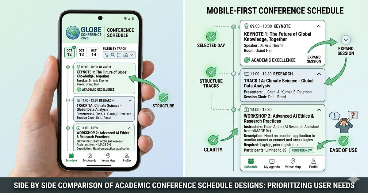
Poor Mobile Schedule Design
The schedule appears as a multi-track table with parallel sessions in columns. On mobile, the table shrinks to unreadable size. Attendees screenshot the desktop version for reference or download a PDF that has the same readability problems.
Effective Mobile Schedule Design
The schedule defaults to a chronological list view on mobile: each time slot is a card showing time, location, and session title. Tapping a session expands it to show paper titles and authors. Filtering buttons at the top allow selecting specific tracks, favorites, or only plenary sessions. Desktop users can still access the multi-track table view, but mobile users get a format designed for small screens.
Implementation rule: Design the schedule for mobile-first, then provide table view for desktop users who want to see parallel tracks. Never rely on PDFs as the primary mobile schedule format.
Key Insight:
Conference websites fail most often by optimizing for how they look in committee presentations rather than how they function when a harried attendee needs to find their next session. The most successful conference sites are designed for use during the conference itself standing in a hallway, phone in hand, 30 seconds to find the right room not for how impressive they appear when projected in a planning meeting.
Pattern 5: Submission System Integration
Most academic conferences use external submission management systems (EasyChair, CMT, OpenReview). The integration between the conference website and submission system is frequently broken: visitors click 'Submit' and land on a generic submission platform page with no conference branding, no clear indication they're in the right place, and confusing instructions.
Poor Integration
The conference website's 'Submit' button links directly to the EasyChair login page. New users see a generic EasyChair interface with no conference name, no submission guidelines, and must create an account before seeing any conference-specific information. Many potential submitters abandon at this point, uncertain whether they're in the right place.
Better Integration
The 'Submit' button leads to a conference website page titled 'How to Submit', which explains: submission system being used (EasyChair), what information you'll need ready (title, abstract, authors, conflicts), formatting requirements, and review process. At the bottom, a prominent button says 'Continue to EasyChair Submission Portal'. This page prepares submitters before they encounter the generic submission system interface.
Implementation rule: Never link directly to external submission systems. Create an intermediary page on your conference website that prepares submitters and confirms they're in the right place.
Pattern 6: Venue Information That Actually Helps
Conference venue information typically includes the building name, address, and perhaps a Google Maps embed. What's missing is the information international attendees actually need: how to get there from the airport, which hotels are walking distance, what the neighborhood is like, and practical details about the venue itself.
Minimal Venue Information
The venue page lists: 'Suntec Singapore Convention Centre, 1 Raffles Boulevard, Singapore 039593' with a map embed. International attendees must research independently: how far is this from the airport? Is it near hotels? How do I get there?
Comprehensive Venue Information
The venue page includes: venue name and address with map, directions from airport (taxi: 20 minutes, $25-30; train: 40 minutes, $2), recommended hotels with walking times, nearby restaurants and coffee shops for lunch, parking information if driving, photos of the actual conference rooms (not just exterior), and accessibility information (wheelchair access, lactation rooms, quiet spaces).
Implementation rule: Venue information should answer every logistics question an international attendee might have. If you find yourself answering the same travel questions repeatedly via email, that information belongs on the venue page.
Planning a conference and need a website that actually helps attendees?
See examples of conference websites that balance information delivery with professional presentation.
→ View conference website examples
Pattern 7: Visual Hierarchy Over Visual Decoration
Academic conference websites often feature elaborate visual designs: custom illustrations, animated backgrounds, parallax scrolling effects. These design elements are fine if they don't interfere with information hierarchy, but they frequently do. A beautiful site that makes finding the submission deadline difficult is a failed site.
Design That Hinders Function
A conference homepage features: large background video of the host city, animated text that fades in and out, navigation items that only appear on hover, and key information presented as small text overlaid on photos (making it unreadable if the photo is busy). The site wins design awards but generates constant support requests from confused potential attendees.
Design That Supports Function
A conference homepage uses clean typography, clear section headings, and a simple color scheme that reinforces information hierarchy. The design is professional but unobtrusive. Visitors immediately understand where to look for dates, registration, and submission information because visual hierarchy guides them. The design serves the content rather than competing with it.
Implementation rule: Test every design decision against the question: Does this help visitors find information faster, or does it make the site prettier while adding cognitive load? Choose function over decoration every time.
Pattern 8: Sponsor Visibility Without Homepage Dominance
Conference sponsors expect visibility, and organizers want to demonstrate sponsor support to lend credibility. The challenge is providing this visibility without turning the homepage into a logo showcase that pushes essential information below the fold.
Poor Sponsor Balance
The homepage opens with a full-width section showing 30+ sponsor logos in five tiers (Platinum, Gold, Silver, Bronze, Supporting). This section occupies the top 40% of the page, pushing actual conference information below the fold. Visitors must scroll past sponsor logos to reach dates, registration, and submission information.
Better Sponsor Balance
The homepage shows essential conference information first. Below this, a single row displays 3-5 premier sponsor logos with 'Supported by' or 'Sponsored by' text, and a link to 'View All Sponsors'. The dedicated sponsors page shows all logos, provides sponsor descriptions, and includes links to sponsor websites. Premier sponsors get homepage visibility; all sponsors get a dedicated showcase page.
Implementation rule: Give premium sponsors homepage visibility, but never push critical conference information below the fold to accommodate sponsor logos. A dedicated sponsors page serves all parties better.
Example: AMES 2023 (Built by SitesGo)

Immediate Information Clarity
The homepage hero section immediately communicates the conference name, dates ('4th-8th December 2023'), location ('Singapore'), and primary call-to-action ('Register'). A visitor knows within seconds whether this conference is relevant to them and what action to take next.
Clean Information Hierarchy
The site uses clear visual hierarchy to guide visitors: large headings for sections, consistent button styling for actions, and adequate white space separating different content blocks. Important information stands out through size and position rather than competing visual effects.
Mobile-Responsive Design
The site adapts well to mobile viewing. Navigation collapses to a hamburger menu, content stacks vertically, and tap targets are appropriately sized. Attendees accessing the site on mobile during the conference can find information without wrestling with the interface.
Organized Information Architecture
Navigation is structured logically: About, Programme, Speakers, Registration, Venue, Contact. Each section addresses a specific visitor need rather than mixing information types. This organization reduces the cognitive work required to find specific details.
What Makes This Effective
The AMES 2023 site succeeds because it prioritizes information delivery over visual spectacle. The design is clean and professional, but it serves the content rather than competing with it. Visitors can quickly determine if the conference is relevant, find essential details, and take action (register, submit, find venue) without navigation friction.
Pattern to apply: This example demonstrates the core principle that great conference websites are measured by how quickly visitors can find what they need, not by visual complexity. The design supports this goal through clear hierarchy, logical organization, and mobile optimization.
Pattern 9: Accepted Papers Listed Early
Once papers are accepted and authors notified, the list of accepted papers becomes valuable information for potential attendees. Many conferences delay publishing this list until weeks before the event, missing an opportunity to drive registration from people interested in specific presentations.
Why This Matters
A researcher decides whether to attend a conference based partly on whether there will be relevant presentations. Publishing accepted papers as soon as authors are notified (typically 2-3 months before the conference) gives potential attendees time to secure funding, arrange travel, and register. Waiting until one month before the conference forces late registrations and reduces attendance.
Implementation
Add an 'Accepted Papers' page as soon as notifications go out. List papers by session or track with: paper title, author names, and author affiliations. This information is sufficient for potential attendees to evaluate relevance. Abstracts can be added later if desired. Update the homepage to prominently mention 'View Accepted Papers' once the list is live.
Implementation rule: Publish accepted papers list immediately after author notifications. This drives registration from people interested in specific work and increases overall attendance.
Pattern 10: Contact Information That Actually Works
Conference websites routinely list contact information as a generic email address (info@conference.org) with no indication of response time or what inquiries are appropriate. This leads to unanswered emails or delayed responses because no one person owns the inbox.
Poor Contact Design
The contact page shows: 'Email: conference2026@university.edu'. A visitor emails asking about visa invitation letters, submission format, and hotel recommendations. The email sits unanswered for two weeks because three different committee members thought someone else would respond.
Better Contact Design
The contact page provides specific contacts for different needs: 'Paper Submissions: program-chair@conference.org', 'Registration & Payments: registration@conference.org', 'Visa Letters: visa@conference.org', 'General Inquiries: info@conference.org'. Each address has a designated owner who monitors it. Response time expectation is stated ('We typically respond within 2 business days').
Implementation rule: Segment contact information by inquiry type, assign ownership, and set response time expectations. A generic contact email that no one monitors helps no one.
Technical Implementation: Platform and Performance
Conference websites have specific technical requirements that differ from permanent institutional sites. These requirements stem from their temporary nature, traffic spikes, and the fact that they're often built by academic volunteers rather than professional web developers.
Platform Selection
Best options: Webflow, Squarespace, or WordPress with a good theme. These platforms allow non-developers to create professional sites without custom coding.
Avoid: Custom-built sites unless you have dedicated developer support. Conference organizing committees rarely have sustained technical capacity, and custom sites break when the original developer graduates or changes institutions.
Mobile Performance
Conference websites must load quickly on mobile networks in the venue area. Test the site on 4G (not just wifi) before launch. Optimize images aggressively; a beautiful hero image that takes 5 seconds to load on mobile creates a terrible first impression.
Registration System Integration
Most conferences use external registration systems (Eventbrite, Cvent, university-hosted systems). The registration button should either: (a) link to a pre-filled registration form with conference details already populated, or (b) link to an intermediary page explaining what information registrants will need, then forward to the registration system.
Content Updates During Conference
During the conference itself, organizers often need to post last-minute room changes, schedule updates, or announcements. The site's content management system must allow quick updates from mobile devices. Test whether organizers can post an announcement from a phone while standing in the conference venue.
Common Conference Website Mistakes (And How to Fix Them)
Mistake 1: Launching Too Late
Example: The conference is scheduled for September, but the website doesn't launch until April only 5 months before the event. By this time, many potential attendees have already committed to competing conferences.
Fix: Launch a minimal site 12-15 months in advance showing: conference name, dates, location, organizing institution, and a 'More details coming soon' message. Add details incrementally rather than waiting for completeness.
Mistake 2: PDF Program Instead of Web Schedule
Example: The conference schedule is published as a PDF download, forcing attendees to open a separate file on mobile devices to see what's happening next.
Fix: Build the schedule as a web page with mobile-friendly list view. Offer PDF download as an optional format for those who prefer it, but the primary schedule should be a responsive web page.
Mistake 3: No Clear Submission Guidelines
Example: The 'Call for Papers' page says 'Submit via EasyChair' with a link, but provides no information about formatting, page limits, or review process. Potential submitters must explore the EasyChair site to find these details.
Fix: Create a comprehensive 'Author Guidelines' page that includes: paper format (LaTeX/Word templates), page limits, anonymization requirements, review process (single/double blind), and number of reviews per paper.
Mistake 4: Outdated Information Persisting
Example: The submission deadline was extended from March 1 to March 15, but the homepage still shows March 1. Potential submitters assume they missed the deadline.
Fix: Assign one person responsibility for keeping dates updated across all site pages. When deadlines change, update the date everywhere it appears and add a 'Recently Updated' notice temporarily.
Mistake 5: Requiring Desktop for Key Functions
Example: The schedule, venue map, or registration form only works properly on the desktop. Mobile visitors encounter broken layouts or functionality that doesn't work with touch input.
Fix: Test every page and every interactive element on actual mobile devices (both iOS and Android) before launch. If something doesn't work on mobile, fix it or provide an alternative mobile-friendly version.
After the Conference: Archive or Redirect
Once the conference ends, the website needs a post-event strategy. Two approaches work:
Option 1: Archive
Convert the site to an archive by adding a banner: 'This conference took place December 4-8, 2023. Information is preserved for reference.' Keep the schedule, accepted papers list, and program committee information accessible. This serves researchers who want to find papers presented at the conference.
Option 2: Redirect to Next Year
If the conference runs annually, redirect to the next year's site and provide a link to archived previous years. This ensures visitors always land on current information rather than outdated dates from past editions.
What not to do: Never leave an outdated conference site live without clear indication that the event has passed. Visitors who find the site via search may not realize they're looking at last year's information.
The Core Principle: Reduce Decision Friction
The best conference websites make it easy to decide whether to attend, easy to register, and easy to navigate once registered. Every design choice should reduce the cognitive effort required to answer visitor questions. When a conference website forces visitors to hunt for essential information, requires multiple clicks to reach deadlines, or presents information in formats that don't work on mobile, it's actively working against its own purpose.
Conference organizing is volunteer work with limited time and resources. A good conference website doesn't require elaborate design or advanced technical capability. It requires clarity about what visitors need and willingness to prioritize information delivery over visual decoration. The AMES 2023 example demonstrates that clean, well-organized, mobile-responsive information architecture serves conference goals far better than visually complex sites that obscure essential details.
Ready to build a conference website that attendees will actually use?
We specialize in academic conference websites that prioritize information accessibility over visual complexity. Our sites work on mobile, load fast, and make it easy for attendees to find sessions, submit papers, and register the things that actually matter for conference success.
-> Get a quote for your conference website
Frequently Asked Questions
How far in advance should a conference website launch?
Launch a basic site 12-15 months before the conference with dates, location, and organizing institution. This allows potential attendees to mark calendars and plan around the date. Add detailed information incrementally: submission deadlines 8-10 months out, registration 6 months out, program 2-3 months out.
Should conference websites include videos or animations?
Only if they load quickly on mobile and don't interfere with information access. A background video that makes text hard to read or a loading animation that delays homepage access both hurt more than they help. When in doubt, prioritize fast loading and clear information over visual effects.
What's the most important page on a conference website?
The homepage, because it determines whether visitors continue exploring. If the homepage doesn't immediately answer 'What is this conference? When? Where? Should I attend?', many visitors leave without clicking further. The second most important pages are registration and submission, because these drive conference participation.
How do I handle multiple language versions of a conference website?
For international conferences, provide English as the primary language with optional translations for local languages. Use a clear language selector in the top navigation. Important: keep all versions updated simultaneously. Outdated translations are worse than no translations, as they provide incorrect information.
What happens if the conference is postponed or cancelled?
Add a prominent banner to every page announcing the change. Update the homepage hero section immediately. Send emails to everyone who registered or submitted papers. Keep the website live with updated information rather than taking it down, as people will continue searching for conference details. If postponed, announce the new dates as soon as they're confirmed.
.gif)


