

Initial Summary
Most startup websites fall into one of two traps: they look beautiful but communicate nothing, or they communicate clearly but look like they were built over a weekend. The startups that convert visitors into leads, investors, and customers consistently avoid both extremes. They combine clear strategic messaging with professional, intentional design and they build their sites around the specific audience they are trying to convert. This article reviews real startup website examples across B2B, deep-tech, and SaaS categories, unpacks the design and conversion patterns behind each, and draws out what any startup can apply to its own site.
Why Startup Website Design Is Harder Than It Looks
A startup website has to do something that established company websites don't: it has to build trust from zero. A visitor landing on your startup's site has never heard of you, has no reason to believe your claims, and has multiple competitors' sites open in other tabs. In this context, design is not decoration it is a trust signal. A site that looks polished, loads quickly, and organises information clearly communicates that the team behind it is competent, detail-oriented, and worth taking seriously.
At the same time, design cannot substitute for clear messaging. The most common mistake early-stage startups make with their websites is prioritising visual impressiveness over communication clarity. Visitors don't stay on a beautifully designed site that doesn't tell them what the product does. They leave.
Key Insight: Research by Nielsen Norman Group consistently shows that users spend an average of less than 60 seconds on a homepage before deciding whether to stay or leave. For startups, which lack the brand recognition of established companies, the homepage has one job: clearly communicate what you do, for whom, and why it matters in under 20 words of headline copy.
1. Stripe — The Gold Standard for B2B SaaS Communication
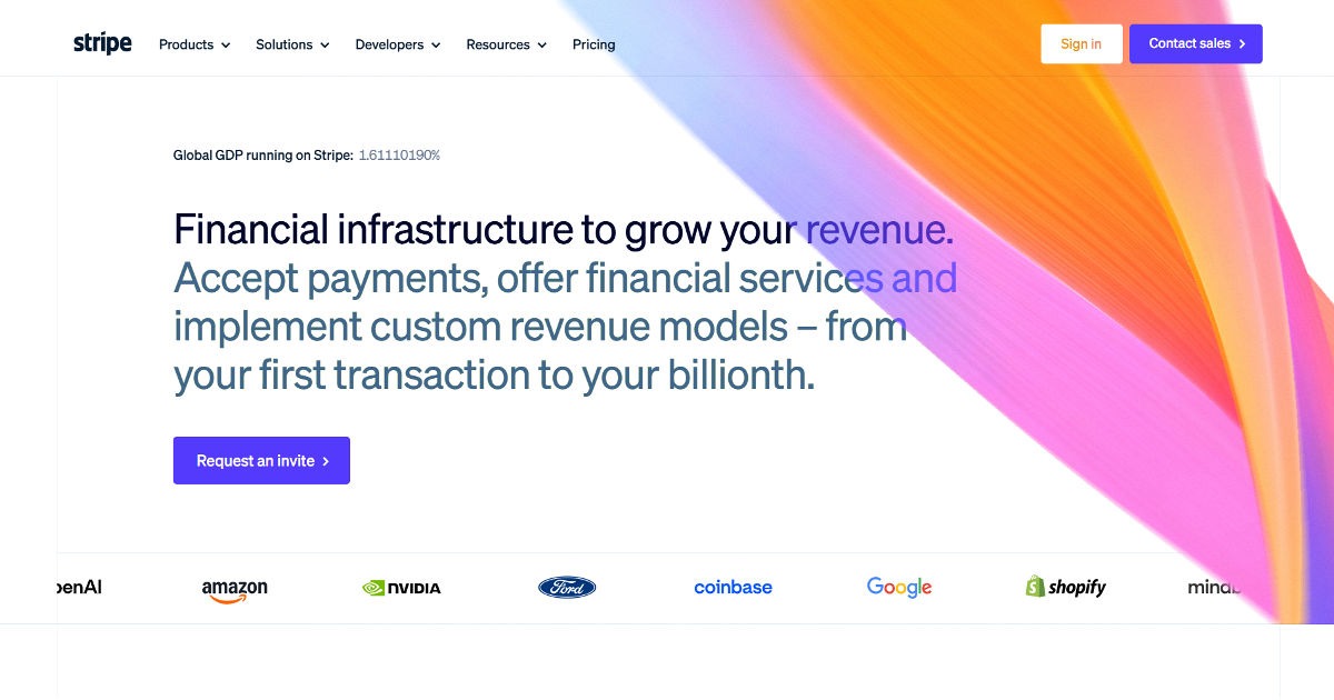
Stripe's website is studied by startup founders and designers around the world, and for good reason. Despite selling an extremely complex product, a global payments infrastructure platform; Stripe's homepage communicates with remarkable clarity.
What works:
- Headline simplicity: Stripe's headline cuts to the core value proposition without jargon. It tells developers and business owners exactly what the company does and why they should care in a single sentence.
- Visual hierarchy: The page guides your eye from headline to social proof to primary CTA in a clean, unambiguous sequence. There is no confusion about what Stripe wants you to do next.
- Audience segmentation by product: Rather than forcing every type of customer through a single messaging funnel, Stripe's navigation immediately segments by product area and use case, allowing different buyer types to self-select into the right content path.
- Technical credibility through documentation: A prominent link to Stripe's developer documentation is on the homepage. This signals to the technical buyers who actually implement payment systems that Stripe takes developer experience seriously.
Pattern to steal: Your hero section should answer three questions in under five seconds: What do you do? Who is it for? Why should I care? Every word that doesn't answer one of these questions should be cut.
2. Linear — Design-Led B2B SaaS That Converts
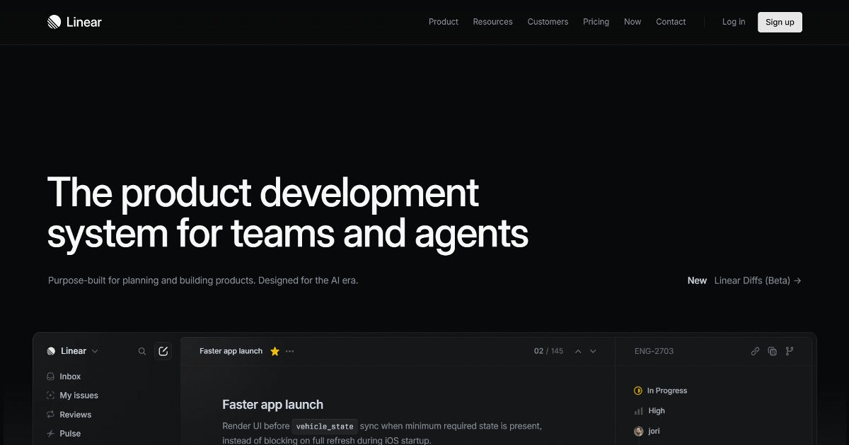
Linear, the project management tool for software teams, is frequently cited by startup designers as one of the best examples of a B2B SaaS site that is both visually striking and highly effective at conversion.
What works:
- Dark, premium aesthetic that signals a specific audience: Linear's dark design is not just a style choice — it signals immediately to software engineers that this is a tool built for them, by people who understand their aesthetic preferences. It is the audience signalling through design.
- Ruthlessly specific headline: "Linear is a purpose-built tool for planning and building products." Not "the best project management software" — a specific, honest description of exactly what it is.
- Speed as a feature: Linear's website is extremely fast — sub-second page loads. For a productivity tool promising speed, a slow website would be a glaring contradiction. The site's performance is itself a product demonstration.
- Social proof from recognisable logos: Early-stage customers at recognisable companies are featured prominently. This social proof functions as a credibility shortcut for prospects.
Pattern to steal: Your website's design should signal your target audience before a visitor reads a single word. Dark aesthetic for engineers, clean minimal for creative professionals, enterprise-formal for corporate buyers.
3. Notion — Community-Led Growth Through Website Design
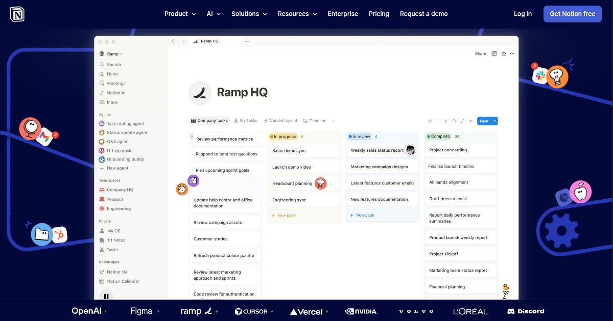
Notion's website is a study in how to design for viral growth. Notion grew primarily through community sharing and word-of-mouth, and its website design reflects and amplifies this growth model.
What works:
- Template gallery as a conversion tool: Instead of trying to explain Notion's flexibility through text, the website shows it by displaying hundreds of community-built templates. Visitors can immediately see themselves using the product.
- Multiple entry points for different use cases: Notion serves individuals, startups, and enterprises. The homepage navigation provides clear, distinct entry points for each audience segment rather than trying to serve everyone with the same messaging.
- Bottom-up enterprise strategy reflected in pricing page: Notion's pricing page is designed to start with a free tier that converts individuals, then escalates to team and enterprise plans as organisations see the value. The website's entire architecture reflects this bottom-up strategy.
Pattern to steal: If your product has multiple use cases, design distinct content paths for each audience segment. Don't make different buyer types hunt through content built for someone else.
Invest in redesigning your homepage
testing your current headline with a simple five-second test tool. Show your homepage to five people who match your target customer profile and ask them to describe what your company does after five seconds. Their answers will tell you whether your messaging is landing or not.
→ We’ll help you redesign your website!
4. Figma — Showing the Product Doing the Job
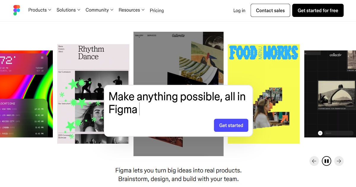
Figma's website is one of the best examples of "show, don't tell" in B2B SaaS design. Rather than describing what Figma does, the site demonstrates it.
What works:
- Live or animated product demos embedded in the homepage: Figma's homepage has used animated product demonstrations that show the collaborative design tool in action. A visitor understands the product's core value proposition in seconds without reading a single feature bullet point.
- Community as social proof: Figma's community of designers, templates, and plugins is featured prominently. This positions Figma not just as a tool but as an ecosystem — significantly raising the cost of switching for potential customers.
- "Made with Figma" gallery: Showing real outputs produced by real users is one of the most effective forms of social proof for a design tool. It answers the implicit question "can this tool produce professional results?" with evidence rather than claims.
Pattern to steal: If your product produces visible outputs — designs, data visualisations, analyses, code — show those outputs on your website. Evidence converts better than claims.
5. Palantir — Deep-Tech Enterprise Website Done Right
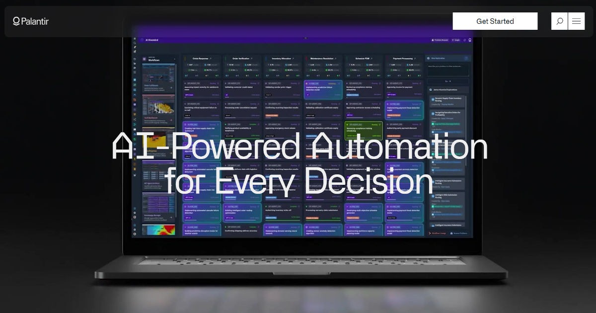
Palantir's website is a masterclass in communicating complex, sensitive enterprise technology to multiple sophisticated audiences simultaneously.
What works:
- Mission-first framing: Palantir leads with mission rather than product feature lists. The site communicates a worldview — the importance of data infrastructure for institutions that matter — before making any product claims.
- Segment-specific content tracks: Government, commercial, and partner audiences have distinct content paths. The messaging, case studies, and proof points differ significantly by segment.
- Case studies with specific, quantified outcomes: Palantir's case studies include specific operational outcomes. This level of specificity is the highest form of enterprise sales evidence and significantly more persuasive than generic testimonials.
Pattern to steal: For enterprise sales, segment your website by buyer type and make sure each segment's content path answers their specific questions with evidence appropriate to their level of sophistication.
6. Loom — Converting Through Radical Clarity
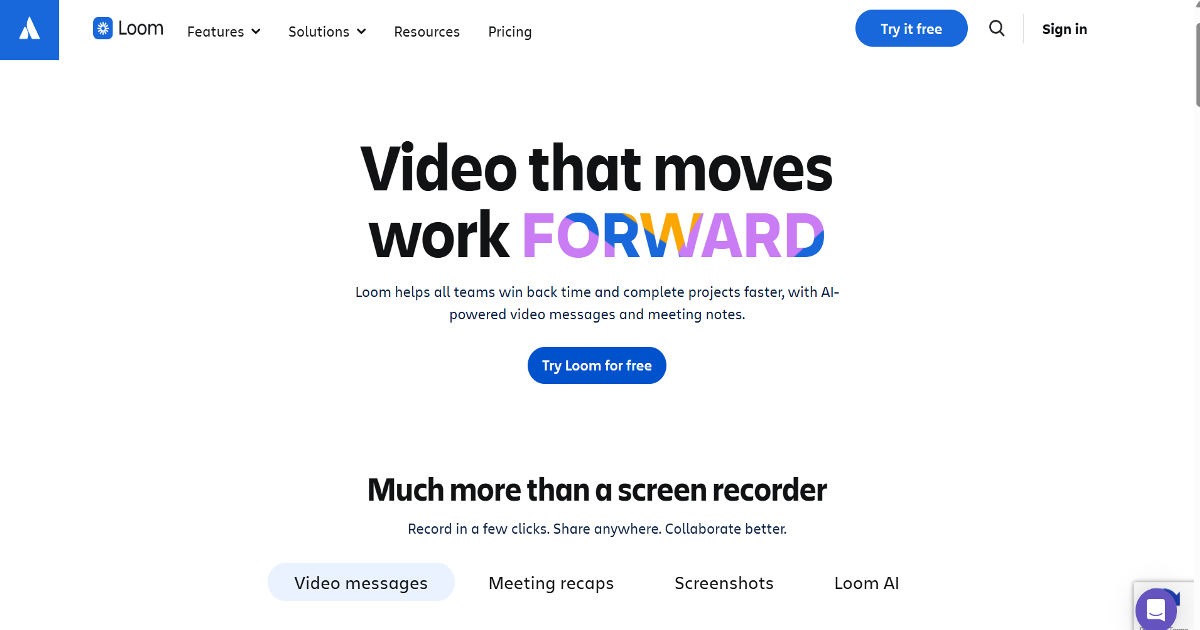
Loom, the video messaging platform, grew from zero to a multi-billion dollar acquisition partly on the strength of a product that demonstrably solved a specific problem — and a website that communicated that solution with exceptional clarity.
What works:
- Video on the homepage explaining the product: Appropriately for a video messaging product, Loom's homepage features a short video demonstrating the product. The medium is the message.
- Specific use case headlines: Rather than generic productivity claims, Loom's homepage addresses specific pain points: replacing long meetings, giving async feedback, and onboarding remote employees.
- Frictionless free tier CTA: The primary CTA is to start using the product for free, immediately. Loom reduced conversion barriers to the absolute minimum.
Pattern to steal: Identify the single most specific, most painful problem your product solves. Put that problem — and the solution — in your headline. Generic benefit statements convert at a fraction of the rate of specific pain-point addressing.
Key Insight: Research by Google found that a one-second delay in page load time reduces mobile conversions by up to 20%. For startups without the brand equity to keep visitors waiting, site speed is a direct conversion lever not a technical detail to be optimised later.
The Design Patterns That Separate High-Converting Startup Websites
Across these examples, seven consistent patterns emerge in startup websites that convert effectively:
Pattern 1: Specific headlines over generic ones. "The fastest way for accountants to close their books" converts better than "The accounting platform for modern businesses."
Pattern 2: Social proof above the fold. Customer logos, user counts, or review scores positioned near the hero section dramatically increase conversion rates for early-stage startups that lack brand recognition.
Pattern 3: Show the product. Screenshots, demos, or videos of the actual product in use convert better than illustrated icons or abstract visuals. Visitors want to see what they're getting.
Pattern 4: Segment CTAs by audience. "Start Free Trial" for self-serve users, "Request a Demo" for enterprise buyers, "Talk to Sales" for complex deals. Matching the CTA to the buying journey of each audience segment significantly improves conversion.
Pattern 5: Fast loading times are non-negotiable. A one-second delay in page load time reduces mobile conversions by up to 20%. For startups without the brand equity to keep visitors waiting, site speed is a direct conversion lever.
Pattern 6: Pricing transparency reduces friction. B2B SaaS buyers research pricing before any other content. Startups that hide pricing create friction that pushes potential customers toward competitors.
Pattern 7: Navigation should be minimal and audience-oriented. The strongest startup websites have five to seven navigation items, organised by audience journey or product area, not by internal company structure.
Is Your Startup Website Losing Leads on the First Page?
Most startup websites answer the wrong questions. Visitors ask "what does this do, why should I care, and can I trust these people?" Many startup homepages answer "here's our technology, here are our features, here's our awards page." The gap between the questions visitors ask and the answers your homepage gives is where leads are lost.
→ Get a free conversion audit of your startup homepage
Frequently Asked Questions
How much should an early-stage startup invest in website design?
At the pre-seed stage, a clean, functional site built on a modern template (Webflow, Framer, or Squarespace) with well-written copy is sufficient. The investment at this stage should go into copy quality and messaging clarity more than visual design. As you approach Series A, with investor meetings and enterprise sales conversations, a professionally designed site — typically USD 5,000–25,000 for a quality B2B startup site — is a worthwhile investment. Poor website design in a Series A process communicates brand and execution risk.
Should a startup use a template or custom design?
For most pre-Series A startups, a premium template with customised copy, colours, and photography provides 90% of the conversion performance of a fully custom site at 20% of the cost. The marginal conversion improvement of a fully custom design is rarely justified until a startup has strong product-market fit and is using the website as a primary revenue-generating channel. Invest in copy first, design second.
How important is mobile optimisation for a B2B startup website?
Extremely important, even for pure B2B. Over 50% of business-related web browsing now happens on mobile devices. A CFO who encounters your company at a conference and searches your name on their phone is going to form a first impression on that mobile screen. A site that breaks on mobile communicates the same thing to a B2B buyer as it does to a consumer: this team doesn't pay attention to details.
What is the most common startup website mistake?
Prioritising "looking impressive" over "communicating clearly." Many startup founders, especially in deep-tech, are seduced by heavy animation, abstract visual design, and technically complex web experiences that showcase the sophistication of their technology. Sophisticated investors and buyers are not impressed by website technical complexity — they are impressed by clear, specific, well-evidenced value propositions delivered through professional design. Clarity converts; complexity confuses.
When should a startup redesign its website?
The clearest signals that a redesign is needed are: conversion rates below benchmark for your industry, significant changes in target audience or go-to-market strategy, a new major product launch, and fundraising processes where the website is actively working against the pitch. Don't redesign on the basis of "it looks dated" — redesign on the basis of clear evidence that the site is failing to convert the audience you need it to convert.
.gif)


