

Initial Summary
Research lab websites are judged in seconds by prospective PhD students tabbing between offers, by industry collaborators deciding who to email, and by grant reviewers forming first impressions before reading a single proposal. A great lab site communicates mission, credibility, and momentum before the visitor has scrolled once. This article reviews ten genuinely excellent research lab websites from across the globe, unpacks what makes each one work, and draws out the design and content patterns worth stealing.
If you've landed on a lab website and immediately felt lost walls of jargon, a navigation bar with seventeen items, a "Latest News" section last updated in 2019 you know how common bad academic web presence is. But there's a growing number of lab sites that break this mold. They're clear, current, and visually confident. These are the ten worth studying.
Why Research Lab Website Design Matters More Than Ever
Labs now compete globally for PhD talent, postdocs, industry partners, and grant reviewers, most of whom form their impression of a lab before speaking to anyone in it. Your website is a 24/7 recruiting tool, a trust signal for collaborators, and often the first result that appears when someone Googles your name after a conference talk.
The gap between a strong lab website and a weak one has never been wider and the cost of getting it wrong has never been higher.
Key Insight: The five-second test: within five seconds, a visitor should know (1) what the lab researches, (2) who leads it, and (3) whether it's currently active. If any of these fail, visitors leave.
1. Terrer Lab – MIT

Designed by SitesGo
The Terrer Lab at MIT's Department of Civil and Environmental Engineering is one of the cleanest and most mission-driven lab websites in the ecological sciences. Led by Prof. Cesar Terrer, the site covers terrestrial carbon ecology and natural climate solutions and high-stakes research communicated with striking clarity.
- "Big Questions" framing: Instead of listing research topics as noun-heavy jargon, the site poses them as genuinely intriguing questions: "How much carbon can we recapture in soils with cropland restoration?" Visitors immediately understand what the lab is working on and why it matters.
- Photo-rich hero: The homepage uses immersive field photography forests, soils, field researchers rather than stock imagery, communicating that this is real science happening in real places.
- Values section: A dedicated section on inclusion and diversity frames the lab's culture directly, which is increasingly important for attracting PhD applicants who are evaluating more than just publication records.
- Custom domain: terrerlab.com, not a subdomain, making it professional, brandable, and portable if Prof. Terrer ever moves institutions.
Pattern to steal: Reframe your research areas as genuine questions visitors would want answered. It transforms a dry topic list into a compelling research agenda.
2. MathEXLab – NUS Singapore
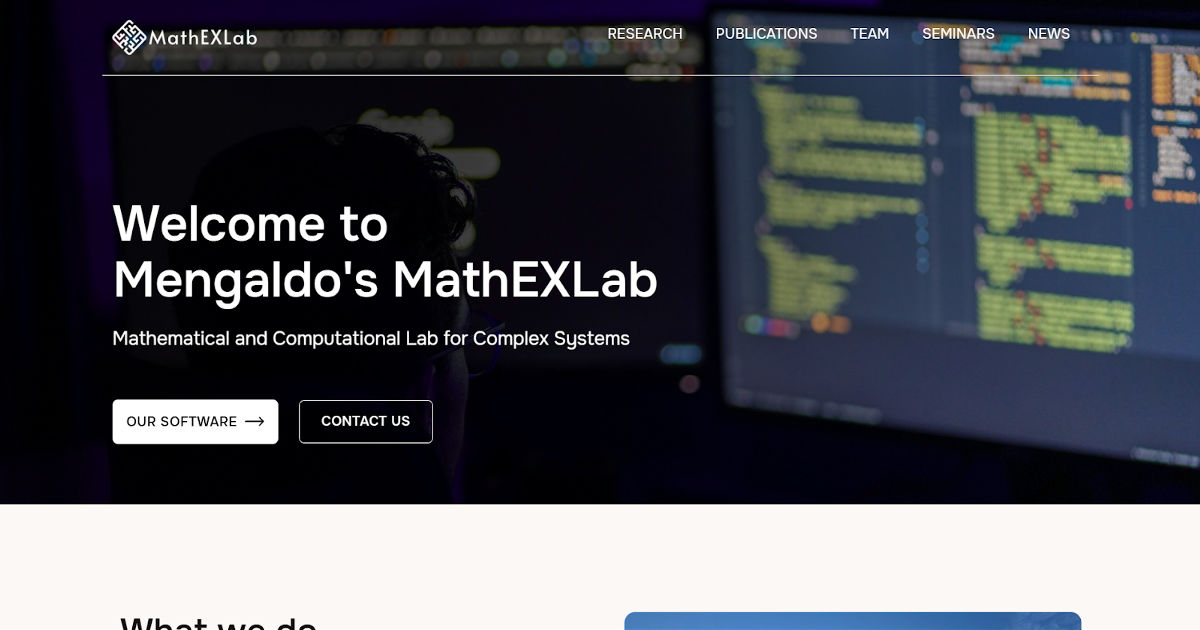
Designed by SitesGo
Prof. Gianmarco Mengaldo's MathEXLab at NUS is a masterclass in turning abstract, highly technical research into a compelling web presence. The lab works on mathematical and computational approaches for complex systems not the easiest sell to a non-specialist, but the site handles it with elegance.
- Opening with a Galileo quote: Rather than a generic mission statement, the homepage opens with a Galileo quotation about mathematics being the language of the universe. It immediately signals intellectual ambition and frames the lab's identity without a single jargon-heavy sentence.
- Open-source commitment featured upfront: A direct link to the lab's GitHub is on the homepage a powerful credibility signal for computational researchers who want to verify that the science is reproducible.
- Collaborator wall: A visual row of partner institution logos (NVIDIA, ECMWF, Cambridge, Brown, Columbia, and many more) communicates the lab's reach and funding pedigree at a glance.
- Media and news integration: An interview with the Italian Embassy, a Nature publication highlight, and conference attendance posts are all woven into the homepage news section showing a lab that's active and internationally connected.
Pattern to steal: If your work is heavily technical, lead with a philosophical or narrative frame before diving into methodology. It broadens your audience without dumbing down your science.
3. OSON Lab – NTU Singapore

Designed by SitesGo
The Optical Spectroscopy of Nanomaterials Lab at NTU Singapore is led by Prof. Cesare Soci and demonstrates how a physics-heavy research group can present highly specialised work without alienating prospective students or collaborators.
- Immediate credibility metrics: The homepage leads with three animated counters 200+ publications, 30 research members, and 10 years of community engagement giving visitors instant calibration of the lab's scale and track record.
- Plain-language research summary: Despite covering nanophotonics, quantum sensors, and organic semiconductors, the homepage manages a clear, one-paragraph plain-English explanation of what the lab investigates and why.
- Affiliated centres section: NTU's Centre for Disruptive Photonic Technologies and other affiliations are displayed prominently, giving the lab's work institutional validation beyond the PI's own name.
- Open recruitment signal: A dedicated job openings section with direct contact instructions tells prospective students clearly that the lab is actively building its team.
Pattern to steal: Use animated counters for key metrics (publications, students, years). They communicate track records faster than any paragraph of prose.
4. AESB Lab – NUS Singapore
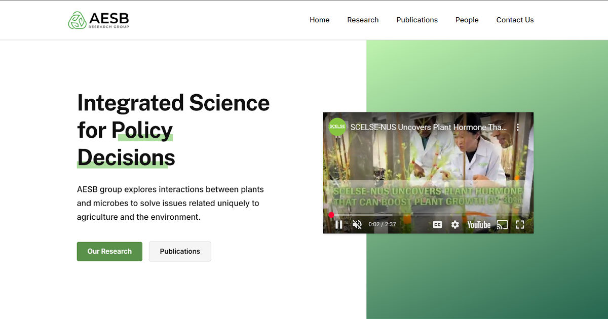
Designed by SitesGo
Prof. Sanjay Swarup's AESB Lab at NUS captures something many lab websites struggle with: a long, distinguished career worth documenting, presented in a way that doesn't feel like a CV dump.
- Interactive grant counter: A live-style grant counter at the bottom of the homepage is one of the most memorable design choices in academic web design. It communicates funding credibility and research activity in a single, scrollable moment.
- Consistent visual identity: Professional photography of the lab's actual research environments, greenhouses, field sites, wet labs creates a colour-consistent, authentic aesthetic across the entire site.
- Career-spanning scope: The site successfully presents decades of research without feeling archival. The design keeps even older work feeling current and relevant.
Pattern to steal: An interactive grant counter is an unusually effective trust signal. If your lab is well-funded, make that visible; it reassures both prospective students and industry collaborators.
5. Soft Robotics Lab – NUS

Designed by SitesGo
The NUS Soft Robotics Lab has one of the most visually dynamic lab websites in engineering research. Soft robotics is an inherently photogenic field bio-inspired mechanisms, compliant grippers, flexible structures and this site uses that visual richness to its maximum advantage.
- Visual-first layout: Every research project leads with compelling imagery of the actual robots and prototypes, making even the most technical project descriptions immediately engaging.
- Custom domain: softroboticslab.info is short, memorable, and clearly signals the lab's identity without any institutional subdomain complexity.
- Research portfolio depth: Projects are presented with enough detail to satisfy a prospective PhD student evaluating fit, but accessible enough that an industry collaborator can assess commercial relevance.
Pattern to steal: If your research produces visually striking outputs robots, medical devices, material structures build your entire website around showcasing them. Never bury photos below text.
Does your lab site look active and recruit-ready or archived?
We’ll review it from a prospective PhD student’s perspective and highlight the gaps
→ Check my lab website impression
6. Francis Crick Institute – London
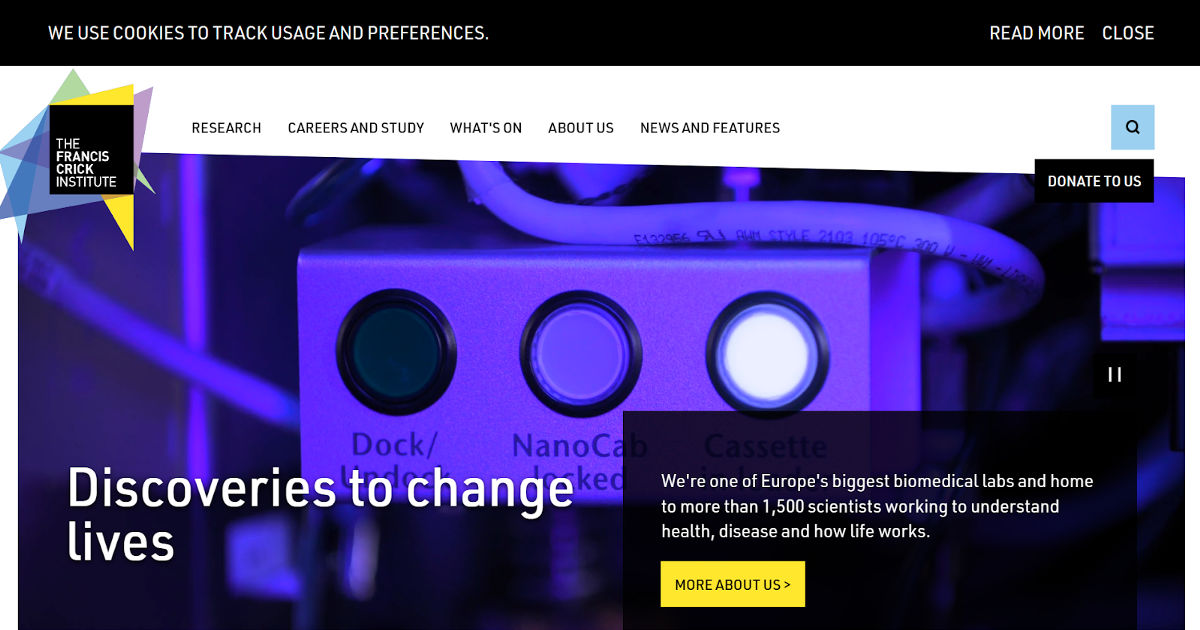
One of Europe's flagship biomedical research institutes, the Francis Crick Institute's website sets the standard for large, multi-group research organisations. What makes it stand out relative to institutions of comparable size is its editorial discipline.
- Storytelling over listing: Rather than presenting research as an exhaustive taxonomy of topics, the site uses news and feature articles to bring research to life, making it accessible to the public, journalists, and potential philanthropists simultaneously.
- On-site exhibitions and seminars: The integration of public engagement events directly into the main site signals that the institute sees science communication as core to its mission, not a side activity.
- Navigation restraint: Despite covering dozens of research groups and hundreds of researchers, the navigation remains clean and intuitive, a significant technical and editorial achievement.
Pattern to steal: At institutional scale, editorial content (features, news, stories) does more than any research taxonomy to communicate what the organisation actually cares about.
7. Human-Computer Interaction Lab – University of Maryland
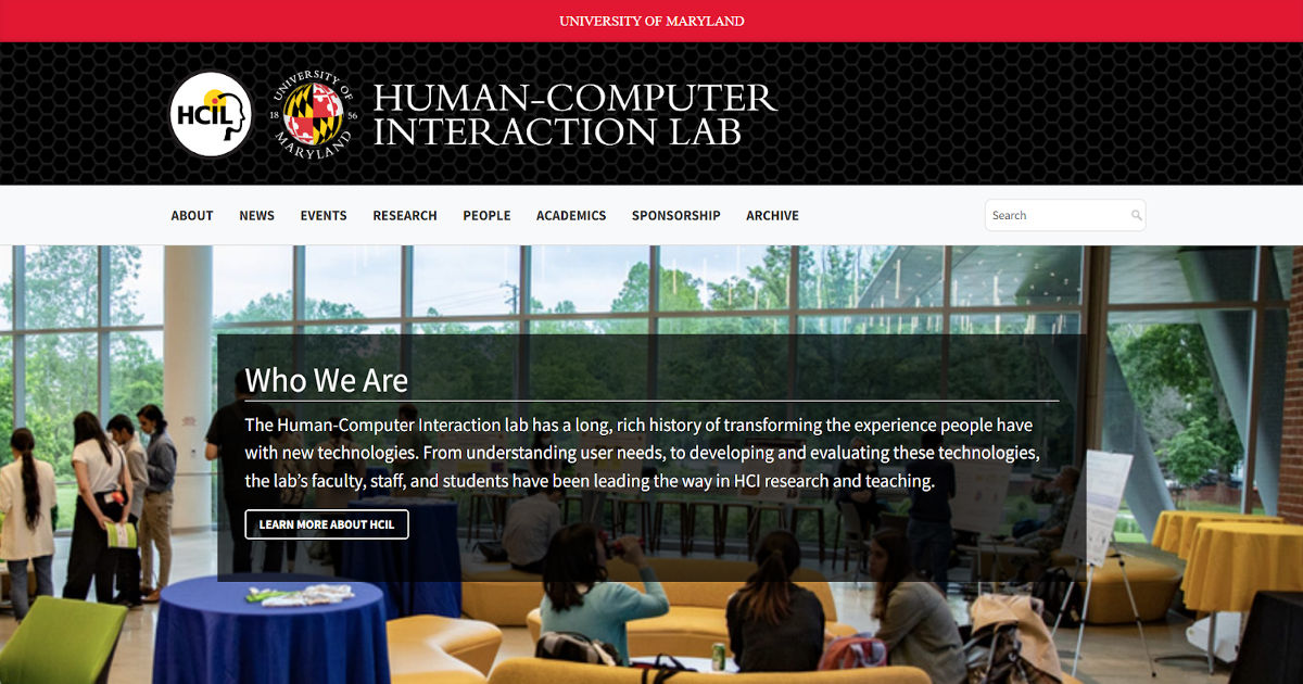
The HCIL at the University of Maryland demonstrates how a long-running research lab can stay approachable while still signalling deep technical authority. Instead of presenting research as finished publications only, the site focuses on interaction fitting for a lab studying how humans engage with technology.
Project-centric structure: Research is organised around problems and prototypes rather than just papers. Visitors understand what the lab builds and tests before encountering formal publications, making the work legible even to non-academics.
Demonstration over description: Videos, interactive demos, and screenshots are used wherever possible. The lab shows behaviour and usability outcomes instead of relying purely on technical explanation, a major accessibility improvement.
Student visibility: Students are prominently featured alongside faculty, reinforcing that the lab is an active learning environment and not just a publication archive.
Pattern to steal: If your research studies real-world behaviour, show the behaviour. Demonstrations communicate value faster than explanations and dramatically widen the audience beyond specialists.
8. BBML – Biological and Biomimetric Materials Laboratory
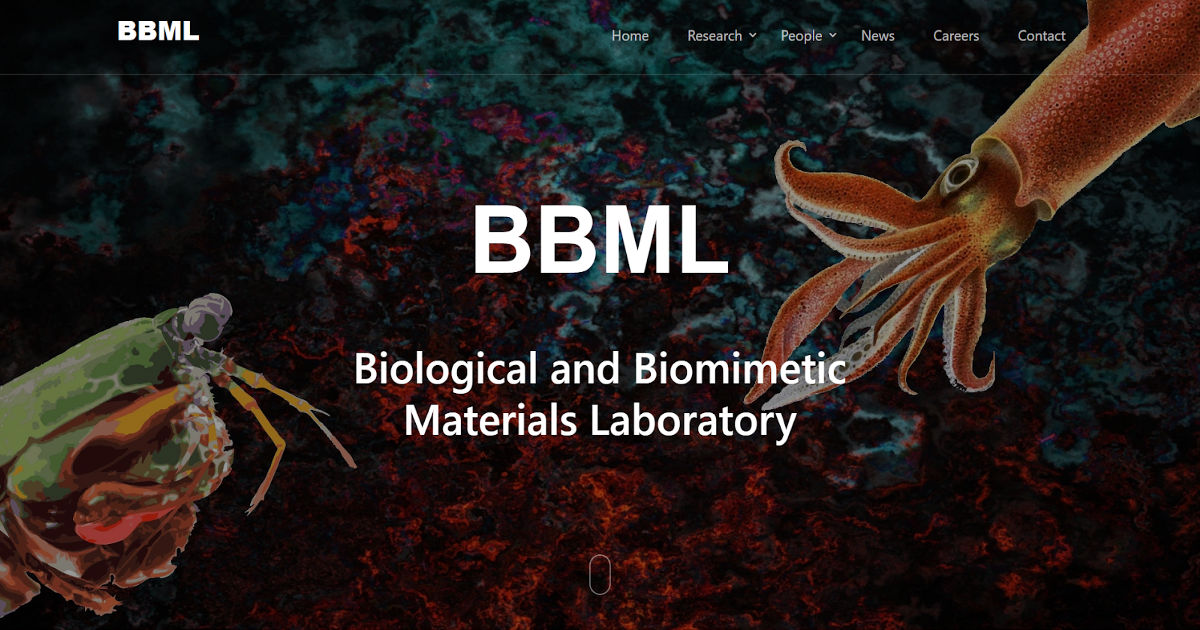
Designed by SitesGo
The Biological and Biomimetic Materials Laboratory (BBML) homepage immediately communicates its research philosophy through imagery before text. Instead of starting with a paragraph of technical description, the site uses striking biological visuals organisms that inspire engineered materials to visually encode the lab’s core idea: learning from nature to design advanced materials. The short, direct title reinforces the concept while the navigation (research, people, careers) supports typical academic audiences.
What works:
- Concept-first communication: Visitors grasp “biomimetic materials inspired by biology” instantly through visuals
- Memorable identity: The distinctive biological imagery creates recall the lab becomes recognizable, not generic
- Aligned aesthetics: The design style matches the research theme, reinforcing credibility and coherence
- Recruitment-friendly structure: Clear sections for research and people guide students and collaborators naturally
Pattern to steal: If your research field has a strong visual metaphor (biology, robotics, space, climate, materials), use it. A lab brand should feel like the research area itself. Visual identity isn’t decoration, it's explanation.
9. Plasticell – Translating Science into a Trustworthy Biotech Brand
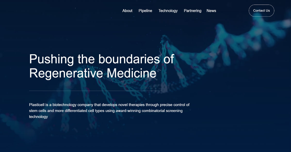
Designed by SitesGo
Plasticell’s website shows how a biotech company can communicate complex research without looking like a journal archive. Instead of overwhelming visitors with technical terminology, the homepage leads with a clear mission advancing regenerative medicine supported by clean visuals, minimal text blocks, and intuitive navigation. The lab imagery immediately signals scientific credibility, while the structured sections (pipeline, technology, partnering) guide different audiences to the information they care about.
What works:
- Instant scientific positioning: The hero image and headline communicate field and purpose within seconds
- Audience-segmented navigation: Investors, collaborators, and researchers each have clear paths (pipeline vs technology vs partnering)
- Credibility through clarity: Rather than dense publications, the site explains the platform and applications in understandable terms
- Corporate-research balance: Feels both like a research lab and a commercial organization important for biotech trust
Pattern to steal: For research labs and academic groups moving toward industry collaboration, clarity beats complexity. A visitor should understand what problem you solve before they learn how science works. Position the mission first, the mechanism second, credibility follows comprehension.
10. Emergent Nanomaterials Lab – Turning a Lab Website into a Research Culture
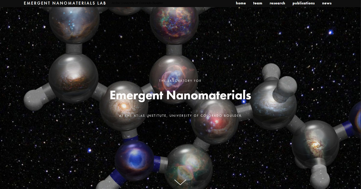
Designed by SitesGo
The Emergent Nanomaterials Lab website shows how a research group can feel memorable by presenting itself as a creative scientific culture rather than a publication repository. Instead of beginning with papers or funding, the site introduces a mindset of interdisciplinary exploration and invention at the nanoscale allowing visitors to understand the lab’s spirit before its technical depth.
Philosophy-led storytelling: The homepage explains how the lab approaches science experimentation, curiosity, and unconventional ideas before detailing specific nanomaterial projects. Visitors first understand the thinking, then the mechanisms.
Belonging-oriented design: Students and collaborators see how the lab works internally: teamwork, creativity, and open collaboration. The site signals what it feels like to join the lab, not just what the lab produces.
Concept-driven research explanation: Projects are framed through applications and ideas (wearable electronics, self-assembling materials) rather than dense terminology, making advanced materials science understandable.
Identity as credibility: Authority comes from a clear intellectual personality rather than long CV sections; the lab feels distinctive instead of interchangeable.
Pattern to steal: People don’t join research areas, they join research cultures.
The Design Patterns That Separate Great Lab Websites
Pattern 1: Evidence Over Claims
Weak sites say "we do cutting-edge research." Strong sites show specific awards, named publications with abstracts, funded grants with amounts, and recent conference presentations. Evidence builds trust; claims don't.
Pattern 2: The Five-Second Test, Always
Within five seconds, every visitor should know what the lab researches, who leads it, and whether it's currently active. If any of these require scrolling or clicking, the homepage has failed.
Pattern 3: People Are the Product
Prospective PhD students are evaluating whether they want to spend five years working with you and your team. Photo-rich team pages, welcome posts for new members, alumni placement records, and a visible lab culture are what convert a curious visitor into an applicant.
Pattern 4: Fresh Content Signals Life
A news section last updated two years ago actively suggests the lab is winding down. Even a brief quarterly post, a new paper, a conference talk, a new student joining keeps the site feeling alive. Monthly updates are ideal; quarterly is the minimum.
Pattern 5: Custom Domains Travel With You
Labs hosted at purely institutional subdomains lose their web presence and Google search equity when a PI moves. A custom domain (terrerlab.com, mathexlab.com) is professional, portable, and protects years of accumulated search visibility.
Pattern 6: Design for Multiple Audiences
Every lab has at least two audiences: peer researchers and prospective students. The best sites like the Eddy Lab or the NUS Child Development Lab design deliberately for a third audience too, whether that's the general public, industry partners, or policymakers. Serving multiple audiences doesn't require compromise; it requires structure.
Does Your Research Lab Website Pass the Five-Second Test?
A great lab website isn't just a portfolio, it's a recruiting tool, a trust signal, and a reputation asset working for you around the clock. The labs on this list have figured that out. Whether you build your own or work with a specialist agency like SitesGo, the investment compounds over every year your lab is active.
Frequently Asked Questions
Should a research lab website be built on WordPress, Webflow, or something else?
For most labs, Webflow strikes the best balance of design quality, ease of maintenance, and flexibility. WordPress is powerful but requires ongoing plugin and security management that most PIs don't want. Static site generators like Hugo or Jekyll work well for technically inclined labs. The key question isn't the platform, it's whether the site is actually maintained after launch.
How long does it take to build a good research lab website from scratch?
A solid, functional site can be built in one to two weeks of focused effort. The actual build is typically under ten hours on a modern platform; the majority of time goes into writing clear research descriptions, gathering team photos, and organising publications in a readable format.
How often should a lab website be updated?
Monthly is ideal for active labs. At an absolute minimum, every quarter. The news section is the highest-priority update target: even a one-sentence post announcing a new publication or a conference talk signals that the lab is active.
Is a custom domain worth it for an academic research lab?
Yes, consistently. Custom domains are professional, portable, and search-friendly. If you ever move institutions, a custom domain means your lab's web presence and all its accumulated search equity comes with you.
.gif)


