

Initial Summary
Web accessibility is no longer a niche concern. It is a legal requirement in a growing number of jurisdictions and an increasingly standard expectation among enterprise clients, government buyers, and users who rely on assistive technologies. The Web Content Accessibility Guidelines (WCAG), published by the World Wide Web Consortium (W3C), are the global technical standard for accessible web design. WCAG 2.1 Level AA is the benchmark most commonly referenced in legislation worldwide including the Americans with Disabilities Act (ADA) in the United States, the European Accessibility Act (which came into force in June 2025), and Singapore's own Infocomm Media Development Authority (IMDA) accessibility guidelines. This guide explains what WCAG 2.1 Level AA actually requires practical, non-technical language and gives you a complete, actionable checklist you can work through page by page.
Why WCAG Compliance Matters Beyond Legal Risk
The standard argument for web accessibility is legal risk reduction and that argument is increasingly compelling. ADA-related web accessibility lawsuits in the United States numbered in the thousands annually by 2024, and the European Accessibility Act's enforcement phase means that businesses operating in or selling to EU markets now face regulatory exposure as well.
But the legal argument undersells the case. Approximately one in four adults globally has some form of disability. Visual impairments, hearing loss, motor difficulties that limit mouse use, and cognitive disabilities that affect reading and navigation are all significantly more common in the general population than most website owners assume. An inaccessible website excludes a substantial portion of potential visitors, clients, and collaborators not as a technical failure, but as a design choice.
The SEO argument is also well-established. Many WCAG requirements overlap directly with practices that search engines reward: structured heading hierarchies, descriptive link text, image alt text, fast load times, and clear page titles all benefit both accessibility and organic search ranking.
Key Insight: Accessibility and usability are not separate concerns; they are the same concern at different ends of a spectrum. A website that is genuinely accessible to a user navigating by keyboard with a screen reader is almost always a better experience for every user. The design decisions that remove barriers for the few reliably improve the experience for the many.
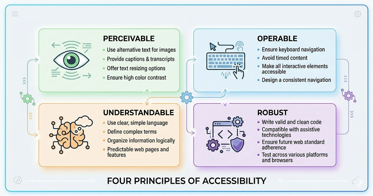
Understanding WCAG: The POUR Framework
WCAG 2.1 is organised around four principles, known by the acronym POUR. Every success criterion in the guidelines flows from one of these four principles.
Perceivable: All information and user interface components must be presentable to users in ways they can perceive. Content that can only be experienced visually, or only through audio, or only through a specific type of interaction, is not perceivable by all users.
Operable: All user interface components and navigation must be operable. This means the site must function for users who cannot use a mouse, who navigate by keyboard, or who use voice recognition software or other alternative input methods.
Understandable: Information and the operation of the interface must be understandable. Content must be readable, the site must behave predictably, and users must be given enough guidance to avoid and correct errors.
Robust: Content must be robust enough to be interpreted reliably by a wide variety of user agents, including assistive technologies such as screen readers. This means using clean, standards-compliant code that works with current and emerging assistive technologies.
WCAG defines three conformance levels: Level A (minimum), Level AA (the standard most commonly required by law and policy), and Level AAA (highest, not expected of all content). This checklist focuses on Level A and Level AA requirements the standard your website should be meeting.
The WCAG 2.1 Level AA Checklist
Section 1: Text Alternatives (Perceivable)
These requirements ensure that non-text content is available in a form that can be understood by users who cannot see or hear it.
✓ All meaningful images have descriptive alt text. Every image that conveys information must have an alt attribute that describes what the image communicates, not what it looks like. A graph showing Q3 revenue growth should have alt text that describes the trend, not just "graph." Purely decorative images should have empty alt text (alt="") so screen readers skip them.
✓ Complex images have extended descriptions. Charts, diagrams, and infographics that convey significant data should have either a long description attribute or a linked text alternative that conveys the same information in prose form.
✓ Audio content has a text transcript. Any pre-recorded audio content must have a text transcript available on the same page or linked from it.
✓ Video has captions and audio descriptions. Pre-recorded video requires synchronised captions for the audio content (for users who cannot hear) and audio descriptions of visual information not conveyed in the soundtrack (for users who cannot see). Live video requires live captions.
Section 2: Adaptable Content (Perceivable)
✓ The page uses a logical heading structure. Headings must be nested logically H1 for the page title, H2 for main sections, H3 for subsections and must not skip levels. Screen reader users rely on heading structure to navigate pages the way sighted users rely on visual scanning.
✓ Content does not rely solely on colour to convey meaning. If a form field turns red to indicate an error, there must also be a text message or icon indicating the error. If a chart uses colour alone to distinguish data series, there must be a legend, pattern, or label that conveys the same distinction without colour.
✓ Content can be presented in a single column without loss of information. Users who increase text size significantly, or who use a narrow viewport, should be able to access all content without horizontal scrolling or content being cut off. This also applies to users of screen magnification software.
✓ Input fields have programmatically determinable purpose. Form fields collecting personal information name, email, phone, address must use the correct autocomplete attributes so that browsers and assistive technologies can identify their purpose. This helps users with cognitive disabilities who benefit from autofill.
Section 3: Distinguishable Content (Perceivable)
✓ Text has a contrast ratio of at least 4.5:1 against its background. Normal-sized text (below 18pt or 14pt bold) must have a contrast ratio of at least 4.5:1. Large text (18pt or above, or 14pt bold) requires at least 3:1. This applies to body text, navigation labels, button labels, and all other text. It does not apply to decorative text, logos, or text in images.
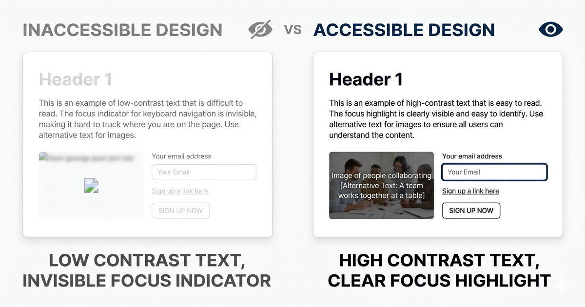
A contrast ratio of 4.5:1 means that a white (#FFFFFF) background requires a text colour no lighter than approximately #767676 for standard text. Online contrast checkers such as the WebAIM Contrast Checker can verify any colour combination in seconds.
✓ UI components and graphical objects meet a 3:1 contrast ratio. Interactive elements buttons, form borders, input fields, checkboxes and meaningful graphical objects (icons used without text labels) must have at least a 3:1 contrast ratio against adjacent colours. A grey checkbox border on a white background that fails this test is inaccessible to users with low contrast sensitivity.
✓ Text can be resized to 200% without loss of content or functionality. When a user increases browser text size to 200%, no content should disappear, overlap, or require horizontal scrolling to access. This is a common failure on sites built with fixed pixel sizes rather than relative units.
✓ Images of text are avoided except where essential. Text rendered as an image text baked into a graphic rather than real HTML text cannot be resized, cannot be processed by screen readers, and does not scale well across devices. Use real HTML text styled with CSS wherever possible.
✓ Content does not autoplay audio without user control. Any audio that plays automatically for more than three seconds must have a mechanism to pause, stop, or control the volume independently of the system volume. Autoplaying audio is deeply disorienting for screen reader users, whose reader output is immediately masked.
Section 4: Keyboard Accessibility (Operable)
✓ All functionality is available by keyboard. Every action a user can take with a mouse clicking a button, opening a dropdown, submitting a form, playing a video must also be achievable using only a keyboard. Tab moves through interactive elements. Enter or Space activates them. Arrow keys control components like sliders and radio groups.
✓ The keyboard focus indicator is always visible. When navigating by keyboard, the currently focused element must be visibly highlighted. The default browser focus ring is sufficient for many elements, but many websites suppress it with CSS (using outline: none) without providing an alternative. This is one of the most commonly failed WCAG criteria and one of the most disabling for keyboard users.
✓ There are no keyboard traps. A user navigating by keyboard must always be able to move focus away from any component. Modal dialogs that trap keyboard focus without providing a way to close them (via Escape key or a clearly labelled Close button) are a common failure.
✓ Skip navigation links are provided. A "Skip to main content" link that is the first focusable element on each page allows keyboard and screen reader users to bypass repeated navigation menus and jump directly to the main content. It is typically visually hidden but becomes visible on keyboard focus.
✓ No content flashes more than three times per second. Content that flashes more than three times per second can trigger photosensitive seizures. This applies to animations, video content, and any other rapidly changing visual element.
Found keyboard or contrast issues you're not sure how to fix?
Those are the two most common and most impactful accessibility failures we see on professional websites. We can audit your site against this checklist and tell you exactly what needs fixing, in plain language, before it becomes a legal or reputational problem.
Section 5: Enough Time (Operable)
✓ Time limits can be turned off, adjusted, or extended. If any page functionality includes a time limit, a session timeout, a timed quiz, an offer countdown, users must be warned before the time expires and given the option to extend it. Exceptions exist for real-time events (live auctions) and security-critical timeouts (banking sessions), but the latter should still provide at least a 20-second extension option.
✓ Moving or auto-updating content can be paused. Carousels, auto-advancing slideshows, scrolling news tickers, and any other content that moves automatically must have a mechanism to pause, stop, or hide it. Moving content can make it impossible for users with cognitive disabilities or attention difficulties to engage with adjacent static content.
Section 6: Navigable Content (Operable)
✓ Every page has a unique, descriptive title. The HTML <title> element of each page must clearly describe the page's content and distinguish it from other pages on the site. "Contact SitesGo" is a useful page title. "Page 3" is not.
✓ Focus order is logical and sequential. When navigating by keyboard, the tab sequence must follow a logical reading order. Focus jumping unpredictably around the page common on sites where CSS has reorganised content visually without updating the DOM order is disorienting and inaccessible.
✓ Link text is descriptive and makes sense out of context. Every link must describe its destination or purpose clearly enough that a user encountering it without the surrounding text would understand where it leads. "Click here" and "Read more" are the most common failure. "Download the Q3 research report (PDF)" is a passing link text.
✓ Multiple navigation methods are available. Beyond the main navigation menu, at least one additional navigation method, a site search, a sitemap, or breadcrumb navigation should be provided to help users find content.
✓ The page language is defined in the HTML. The <html> element must include a lang attribute specifying the page's language (e.g., lang="en" for English). Screen readers use this to apply the correct pronunciation rules and text-to-speech voice. Pages mixing languages must mark the language switches inline.
Section 7: Readable and Predictable (Understandable)
✓ Navigation is consistent across pages. Navigation menus, header elements, and footer links should appear in the same location and same order across all pages of the site. Inconsistent navigation is disorienting for all users and particularly disabling for users with cognitive disabilities.
✓ Interactive components behave predictably. Changing a form selection should not automatically submit the form or navigate away from the page without user action. Changes of context, new tabs, page reloads, form submissions must be initiated by the user or clearly signalled in advance.
✓ Error messages identify the specific error and suggest correction. When a form is submitted with errors, each error field must be identified clearly, the nature of the error must be described in text, and where possible, a suggestion for correction must be provided. "This field is required" is the minimum. "Please enter a valid email address in the format name@example.com" is better.
✓ Input labels are visible and descriptive. Every form input must have a visible label that clearly describes what information is required. Placeholder text alone which disappears when the user starts typing does not satisfy this requirement. Labels must remain visible during and after input.
Section 8: Compatible (Robust)
✓ HTML is valid and standards-compliant. The page's HTML must use correct syntax, properly nested elements, unique IDs, valid ARIA roles so that assistive technologies can reliably interpret the content. Invalid HTML is a common source of screen reader failures that appear nowhere in visual testing.
✓ ARIA roles and attributes are used correctly. ARIA (Accessible Rich Internet Applications) attributes can supplement native HTML to communicate the role and state of complex custom components to screen readers. But incorrect ARIA applying the wrong role, using ARIA to override native semantics unnecessarily is worse than no ARIA. Use native HTML elements where they exist; use ARIA only where native elements are insufficient.
✓ Status messages are programmatically conveyed. Success messages ("Your form has been submitted"), error alerts, and progress notifications that appear dynamically on the page must be announced to screen reader users without requiring focus to move to them. This is typically achieved with ARIA live regions.
Testing Your Website Against This Checklist
No automated tool alone can verify full WCAG compliance; automated tools catch approximately 30-40% of accessibility issues. A complete test requires three layers: automated scanning, manual keyboard navigation testing, and screen reader testing.
Automated tools to start with: WAVE (wave.webaim.org), axe DevTools (browser extension), and Google Lighthouse (built into Chrome DevTools) will identify many common failures quickly and at no cost. Run these first to clear the most common issues before manual testing.
Manual keyboard navigation test: Navigate your entire site using only the Tab, Shift+Tab, Enter, Space, and arrow keys. If you encounter any element you cannot reach, activate, or exit, you have a keyboard accessibility failure.
Screen reader testing: Test with NVDA (free, Windows) or JAWS (Windows) alongside Firefox, and with VoiceOver (built into macOS and iOS) alongside Safari. Navigate through your main pages and complete core user journeys contact form submission, main navigation, reading key content to identify where screen reader users encounter barriers.
Not sure where to start on your own site?
Run the WAVE automated tool on your homepage today. It takes thirty seconds and will surface the most common failures immediately. Then work through the checklist above section by section, prioritising contrast, keyboard accessibility, and alt text as the highest-impact fixes.
-> Build an accessible website that's designed right from the start
Key Insight: Retrofitting accessibility onto a site that was built without it is significantly more expensive than building it in from the start. Every design decision colour palette, typography scale, navigation pattern, form structure is more easily made with accessibility in mind at the outset than corrected after the fact. The cheapest accessibility audit is the one you don't need because the site was built correctly.
Frequently Asked Questions
What is the difference between WCAG 2.1 and WCAG 2.2?
WCAG 2.2, which became the official W3C standard in October 2023, adds nine new success criteria to the existing WCAG 2.1 framework focused primarily on users with cognitive disabilities and improving keyboard support. WCAG 2.2 is fully backward-compatible with 2.1: a site that meets WCAG 2.2 AA also meets WCAG 2.1 AA. WCAG 2.1 Level AA remains the most commonly referenced standard in existing legislation, but the EU Accessibility Act and emerging regulations increasingly reference 2.2. Building to WCAG 2.2 AA is the most future-proof approach.
Do all websites legally need to be WCAG compliant?
It depends on jurisdiction and the type of organisation. In the United States, government websites and websites of businesses covered by the ADA have legal obligations. In the EU, the European Accessibility Act (in force since June 2025) extends requirements to a broad range of private sector businesses. In Singapore, IMDA has published accessibility guidelines for government-linked websites. Even where legal requirements don't directly apply, WCAG compliance is increasingly expected by enterprise clients and public sector procurement. When in doubt, build to WCAG 2.1 AA as a baseline.
Can an accessibility overlay widget make my site WCAG compliant?
No. Overlay widgets JavaScript tools that claim to make a site accessible by adding a toolbar with accessibility options do not make a non-compliant site compliant. They may add a small number of user-adjustable features, but they cannot fix the underlying code issues that create accessibility barriers: missing alt text, keyboard traps, incorrect ARIA, insufficient colour contrast baked into the design. Overlay widgets have been widely criticised by accessibility experts and disability advocacy groups, and their use has not prevented successful legal action against sites that deploy them.
How often should I re-test my website for accessibility?
Every time significant content or functionality is added or changed. Accessibility is not a one-time certification; it is a quality standard that applies to every new page, every new feature, and every design update. Building accessibility testing into your development workflow running automated scans as part of the build process is the most sustainable approach for sites that are regularly updated.
What should I prioritise if I can't fix everything at once?
Fix in this order: colour contrast failures (highest volume, highest impact, easiest to fix), missing or incorrect alt text, keyboard accessibility failures (keyboard traps especially), missing page titles and heading structures, and form label issues. These five categories cover the majority of both the most common and most disabling barriers. Address them first and work through the rest of the checklist systematically.
.gif)


