

Initial Summary
A deep-tech startup website has one job that no other kind of website has to do: make highly complex, often unproven technology feel credible, fundable, and commercially real. Simultaneously, to three completely different audiences. Investors want to know if the science works and whether the market is large enough. Enterprise customers want to know if it solves their problem and if you'll still be around in two years. PhD-level recruits want to know if the team is serious and whether the research culture is one they'd want to join.
Most deep-tech startup websites fail because they were built to serve one of these audiences and silently alienate the other two. This guide covers how to design a site that works for all three from the homepage hero to the technical depth of your research pages and includes the structural patterns used by deep-tech companies that have successfully bridged science and commercial credibility.
If your website reads like a research lab homepage or, worse, like a generic B2B SaaS marketing page with a few quantum computing buzzwords dropped in, this guide is for you.
Why Deep-Tech Websites Are Different
Consumer startup websites sell a feeling. B2B SaaS websites sell workflow efficiency. Deep-tech startup websites have to sell credibility for something that doesn't fully exist yet and do so in a way that doesn't make the technology sound like vaporware.
This is genuinely hard. The science is often pre-commercial. The applications may be 18 months away. The vocabulary is specialist. And yet the website has to convince a Series A investor in a thirty-minute due diligence session that this is real, fundable, and defensible.
Key Insight: Your deep-tech website isn't selling a product. It's selling confidence in a technical thesis and confidence requires evidence, not enthusiasm
The Three Audiences You're Writing For (Simultaneously)
Before building a single page, every deep-tech startup needs to be honest about who lands on the site and what each visitor is trying to answer:
Investors are asking: Is science real? Is the market large enough to justify this? Does this team have the credentials to execute? What's the exit path? They are often generalists evaluating across many verticals and need enough technical depth to feel confident, but not so much that they're lost.
Enterprise customers and partners are asking: Does this solve a problem I actually have? Will this work in my environment? Is this company stable enough to be a vendor? What does implementation look like? They have low tolerance for jargon and high tolerance for specificity about outcomes.
Researchers and technical hires are asking: Is science genuinely novel? Who is the team and where did they train? Is there real intellectual depth here? Is this a serious scientific endeavour or a commercial front for someone else's IP?
Most deep-tech startups write their entire website for the first audience investors and end up with a site that neither enterprise customers nor technical recruits find useful. The solution isn't three separate sites; its layered content architecture that serves each audience at different depths.
The Homepage: Your Technical Thesis in Plain English
The homepage of a deep-tech startup has to do something that sounds contradictory: communicate a complex scientific thesis in language a well-informed non-specialist can understand, while signalling enough technical depth that experts know you're serious.
Lead with the problem, not the solution. Most deep-tech homepages open with a solution description that assumes the reader already understands the problem. They don't. Lead with a clear articulation of the problem you're solving and why existing approaches fail. This is the one piece of the page that works for all three audiences simultaneously.
State your technical thesis in one sentence. What is the core scientific insight that makes your approach possible? Not what your product does that you've figured out that others haven't. This is the heart of a deep-tech pitch and it belongs on the homepage.
Show evidence, not claims. "Industry-leading accuracy" means nothing. "94.3% accuracy on [standard benchmark], published in Nature, July 2024" is evidence. The specificity gap between these two statements is enormous and visitors notice it.
Navigation structure that respects depth: A deep-tech homepage shouldn't try to explain everything. It should make visitors confident enough to go deeper. Your navigation should offer clear pathways: Technology (for those who want the science), Applications (for enterprise customers), Company (for investors), and Careers (for technical recruits).
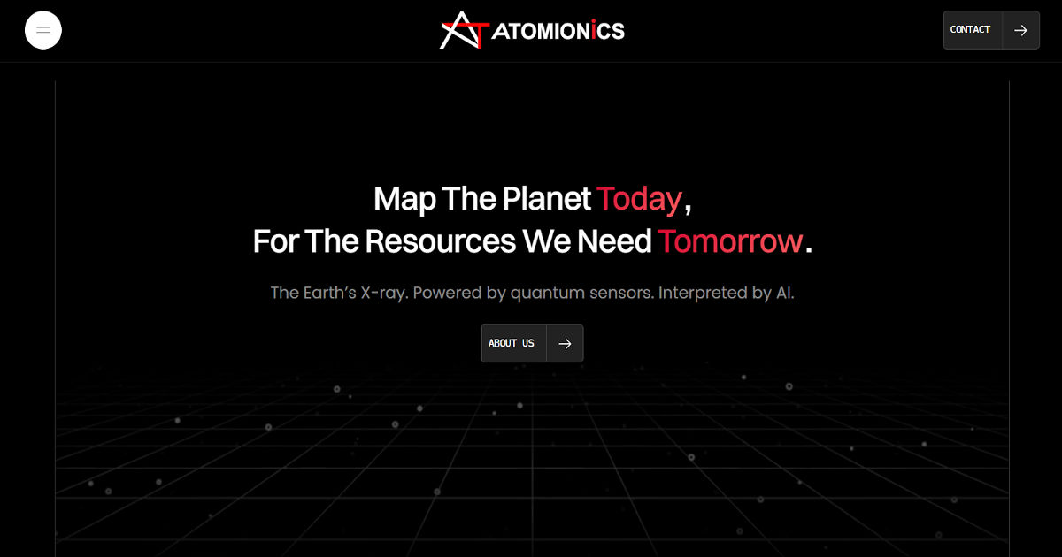
A strong real-world example: Atomionics, a Singapore-based quantum sensing startup, opens its homepage with a single headline that does all three jobs simultaneously: "Map The Planet Today, For The Resources We Need Tomorrow." The sub-headline "The Earth's X-ray. Powered by quantum sensors. Interpreted by AI." translates the underlying physics into a metaphor that a mining executive, a deep-tech VC, and a quantum physicist can all understand from their own vantage point. The problem framing that follows is equally precise: 90% of drills in the mining industry fail, and the industry still relies on 20th-century tools to find the minerals needed for the 21st-century energy transition. Before a visitor has scrolled once, they understand the problem, the thesis, and the stakes. That is a homepage doing its job.
Technology Page: Where You Earn Expert Credibility
The Technology page is the most important page on a deep-tech website and the one most commonly built incorrectly. It is not a product features page. It is where you make the case that your science is real, your approach is defensible, and your team has the expertise to execute.
Layered depth works better than a single register. Open with a plain-language explanation of the core insight (three to four sentences). Follow with a more technical explanation for specialists. Link to published papers, patents, or preprints for those who want primary sources. Each layer serves a different reader without excluding the others.
Publication and patent record prominently displayed. In deep-tech, IP and publications are the primary credibility signals. If you've published in Nature, Science, Cell, Physical Review Letters, or any domain-specific high-impact venue, this belongs on the Technology page above the fold. A patent application number, even pending, signals that you take IP seriously.
Benchmark data beats adjectives. "Significantly faster" needs to become "3.2x faster on [specific benchmark] against [specific competitor approach], independently validated by [institution]." Deep-tech investors and enterprise customers are sophisticated enough to ask for this specificity; providing it proactively eliminates a credibility barrier.
Visual explainers for non-specialists. A well-designed diagram that explains how your technology works at a conceptual level does more trust-building work than three paragraphs of technical text for the majority of visitors. Invest in it.
Applications Page: Where Science Becomes Revenue
Investors want to see a large market. Enterprise customers want to see their specific problem solved. The Applications page bridges these two needs by translating your technical capability into concrete commercial use cases.
Lead with the customer's problem, not your capability. "Our technology enables high-fidelity simulation of protein folding" is a capability statement. "Our technology helps pharmaceutical companies reduce drug discovery timelines by 40%, validated across three Phase II trials" is a value statement. Lead with the second form.
Industry segmentation signals focus. A deep-tech startup that claims to solve problems in healthcare, defence, agriculture, and financial services simultaneously convinces investors of nothing and enterprise customers of less. Pick the one or two verticals where your technology is most mature and represent those concretely. "And potentially in other sectors" is a sentence, not a section.
Case studies or pilots, even anonymised. Nothing builds commercial credibility for a pre-product company faster than evidence that a real organisation ran a real pilot and got a real result. If your partner won't be named, "a Tier-1 US pharmaceutical company" or "a government defence agency" is still evidence of demand. Include it.
A visual that places you in the value chain. Where does your technology sit relative to existing systems? A simple diagram showing how your product integrates with the existing workflow a customer already uses is extraordinarily clarifying for enterprise buyers who are evaluating fit.
Team Page: Your Scientific Credentials Are the Product
In a deep-tech startup, the team is often the primary asset during early fundraising rounds. Before the product exists at commercial scale, investors are betting on the people. The Team page has to carry this weight.
Lead with academic and scientific credentials, not startup titles. A co-founder who did their PhD at MIT under a Nobel laureate and published eight papers before founding the company is a fundamentally different profile from "serial entrepreneur." Both matter, but in deep-tech the scientific lineage comes first.
PI-style profiles work well. Each team member should have a photo, a clear institutional/publication pedigree, and a sentence explaining their specific contribution to the technical thesis. Think of it as a condensed academic bio, not a LinkedIn summary.
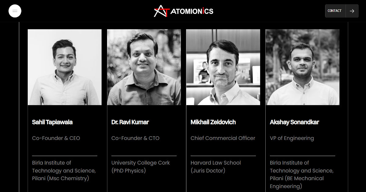
Advisors and boards provide proxy credibility. A deep-tech startup with two co-founders and a scientific advisory board that includes faculty from MIT, Stanford, or ETH Zürich communicates something that a two-person team page alone cannot. If your advisors are genuinely involved and credentialed, give them visible space on the Team page.
Show the team's size trajectory, not just current headcount. "Grown from 2 to 18 in 24 months" communicates momentum. A team page that shows eight headshots communicates stability. Both are useful which you emphasise depends on your current fundraising narrative.
Investors Page: What Sophisticated Capital Wants to See
Many deep-tech startups omit a dedicated investor page entirely and then spend twelve months sending the same deck to every investor who emails. A well-structured investor section, even a simple one filters inbound investor interest, surfaces the right questions early, and signals that the founding team has thought carefully about their raise.
State your stage and raise size openly if appropriate. Ambiguity about whether you're raising and at what stage is read as evasiveness by experienced investors. If you're actively fundraising, say so. If you've closed a round, announce it signals momentum and increases inbound from investors who want to co-invest in follow-on rounds.
Selected investor logos do credibility multiplication. If you have backing from tier-one deep-tech investors Breakthrough Energy Ventures, In-Q-Tel, Khosla Ventures, DCVC, 8VC, Temasek, or equivalent, these logos on your homepage or investor page perform significant trust-building work with other investors evaluating the company.
A one-page investment thesis summary available on request. Some deep-tech startups include a downloadable one-pager on their investor page not the full deck, but a clear, designed summary of the market thesis, technical approach, team, and raise. This reduces friction for investors doing initial triage and ensures your thesis is communicated accurately even when you're not in the room.
Do visitors understand your technology or just that it’s complicated?
We’ll show what your homepage currently communicates in seconds.
What Great Deep-Tech Startup Websites Have in Common
After analysing dozens of deep-tech startup sites from quantum computing to synthetic biology to advanced materials the patterns that separate the credible from the unconvincing are consistent:
Pattern 1: Specificity Over Ambiguity
Vague claims ("breakthrough technology," "proprietary platform," "industry-leading performance") are the hallmark of a company that hasn't figured out how to communicate its advantage. Specific claims with specific evidence are what distinguish a fundable deep-tech company from a deck dressed up as a website.
Pattern 2: Publication Record Front and Centre
Journal publications, conference papers, and patent filings are not supporting material in deep-tech; they are the primary credibility signal. If you've published, make it impossible to miss. A publications section that requires three clicks to find is a publications section that isn't doing any trust-building work.
Pattern 3: The Plain English Summary, Always
Every technical concept that appears on your website should have a plain-English equivalent somewhere on the same page. You don't know whether the person reading your Technology page is a quantum physicist or a corporate development executive at a pharmaceutical company. Write for both.
Pattern 4: Evidence of Commercial Traction, Even Early
Letters of intent, pilot agreements, government contracts, research partnerships with named institutions any evidence that a real organisation has committed resources to your technology in some form is worth surfacing on the website. It distinguishes a company building a product from a research group publishing papers.
Pattern 5: Design That Signals Seriousness Without Pretending to Be Something You're Not
A deep-tech startup that looks like a polished consumer SaaS company raises skepticism from investors who know the product isn't there yet. A deep-tech startup that looks like a university lab homepage raises scepticism from enterprise customers who worry about commercial viability. The right visual register is professional, restrained, and technical dark backgrounds or clean white, clear typography, data-forward visuals.
Common Deep-Tech Website Mistakes
Hiding the science. Some deep-tech founders are advised to make their websites "accessible" and end up with sites so devoid of technical content that investors can't evaluate the underlying thesis. Technical depth, presented clearly, is an asset not a barrier.
Listing features before applications. If someone doesn't understand why your technology matters, listing its features achieves nothing. Lead with the problem, then the application, then the technical feature that makes it possible.
No clear call to action. Many deep-tech sites are informationally complete but conversion-free. Every page should have a clear next step: schedule a technical briefing, download a one-pager, submit an investor enquiry, or apply for a role. Without these, visitors leave with no pathway back.
A team page that undersells credentials. In deep-tech, team credentials are a primary investor evaluation criterion. A team page with small headshots and generic bios is an opportunity cost. Every team member's strongest academic or professional credential should be immediately visible.
Outdated news sections. A "Recent News" section with entries from two years ago signals either that nothing has happened (worrying) or that the team doesn't maintain the site (also worrying). If you can't maintain a news section, remove it.
Does Your Deep-Tech Startup Website Pass the Credibility Test?
SitesGo builds websites for deep-tech startups, university spinoffs, and research-backed companies, designed to communicate scientific credibility, attract investment, and convert enterprise interest into pilot conversations.
Frequently Asked Questions
Should a deep-tech startup website be public or gated?
Public, with appropriate IP caution. Gating your entire website signals insecurity and reduces inbound from investors, customers, and recruits who find you through search. The specific technical details that constitute trade secrets don't need to appear on the website; the scientific thesis, team credentials, and application areas should all be publicly visible.
How much technical detail is too much on a startup website?
The right amount is enough to make a domain expert confident that you know what you're talking about, and not so much that a sophisticated non-expert loses the thread. A good test: can your target enterprise customer's Head of Innovation understand what you do and why it matters from the homepage alone? If not, the site needs a plain-language layer.
Should we publish our research papers on our website?
Yes, with links to the published or preprint versions rather than reproducing the full text. A publications section with titles, venues, and links is one of the highest-credibility signals a deep-tech startup can display. Even preprints on arXiv, bioRxiv, or ChemRxiv signal that the science is real and being submitted for scrutiny.
How do we handle NDA-bound pilot results?
Carefully and usefully. "A Tier-1 European automotive manufacturer ran a six-month pilot and achieved a 31% reduction in simulation time" is evident without being specific enough to breach most NDAs. Work with your legal counsel on what can be disclosed, then disclose as much as permitted the commercial evidence it provides is worth the effort.
When should a deep-tech startup invest in a professionally built website?
Before your first institutional fundraising conversation, not after. The website is frequently checked during investor due diligence. A site that wasn't built for that context is a silent credibility leak in every pitch meeting where the investor later opens a browser.
.gif)


