

Initial Summary
A conference website has the most time-sensitive job in the entire category of event websites: it needs to convince a potential attendee to register often months before the event based entirely on what they can see on the screen. No physical brochure, no venue tour, no conversations with other attendees. The website is the event, until the event happens. Despite this, the majority of academic and professional conference websites are built quickly, updated reluctantly, and designed with the assumption that the audience will read carefully rather than scan impatiently. This guide covers the design, content, and structural best practices that make conference websites work from first visit to confirmed registration.
Why Conference Website Design Is a Unique Design Challenge
Conference websites face a combination of design pressures that few other website types share simultaneously. They must serve multiple distinct audiences first-time attendees evaluating whether to come, returning attendees looking for logistical updates, speakers managing their submissions, sponsors evaluating ROI, and researchers looking for accepted paper lists without becoming so complex that any single audience struggles to find what they need.
They must also communicate strong forward-looking value convincing someone to commit time and money to an event that has not yet happened using a combination of past event social proof and current event content that is often incomplete when the site launches. And they have a hard deadline after which the entire site becomes archival content, meaning the design must work well both before and after the event itself.
Getting this right requires clarity about who the most important audience is at each stage of the event lifecycle, and designing the site's content priority accordingly.
Key Insight: Research by Eventbrite on conference registration behaviour found that 78% of professional event registrations happen within two weeks of a significant promotional touchpoint an email, a social media post, or a personal recommendation and that the conference website is visited by the vast majority of these potential registrants before they register. The website's job is not to generate the initial awareness; it is to convert the intent that other channels generate. A conference website that fails to communicate value quickly and make registration frictionless loses a disproportionate share of these already-motivated visitors.
Best Practice 1: The Hero Section Must Answer Four Questions Instantly
The conference website hero section is the single most important design decision on the entire site. A potential attendee landing on the homepage for the first time should be able to answer four questions within five seconds, without scrolling:
- What is this conference about? (topic, discipline, scope)
- Who is it for? (researchers, practitioners, students, industry — or which combination)
- When and where is it? (dates and location, physical and/or virtual)
- What should I do next? (register, submit, learn more — with a clear CTA)
Conferences that fail to communicate any one of these four things in the hero section see substantially higher bounce rates from visitors who would have been interested if they had stayed longer. The information exists elsewhere on the site — but most visitors won't scroll to find it.
Hero section design principles:
- Use the conference name, edition number, and year as the primary visual anchor. "ISMIR 2026" immediately tells a music information retrieval researcher everything they need to know about scope.
- State the dates and location in large, prominent type — not buried in a sub-menu or footer. "July 14–17, 2026 | Singapore" should be visually impossible to miss.
- The primary CTA should be contextually appropriate to the current stage of the event lifecycle. Pre-CFP: "Subscribe for Updates." Active CFP: "Submit Your Paper." Post-acceptance: "Register Now." Use the most urgent, appropriate action as the primary CTA at each stage.
Best Practice 2: Structure the Site Around the Attendee Decision Journey
A potential conference attendee goes through a predictable decision process: awareness → evaluation → commitment → logistics. A well-structured conference website addresses each stage explicitly.
Evaluation stage content (highest priority before registration opens):
- Keynote speakers, announced as early as possible with compelling bios that speak to why this person's participation matters for this specific conference's audience.
- Programme themes and tracks, described in enough detail that a researcher can assess whether their work fits.
- Past conference highlights — acceptance rates, attendee numbers, papers presented, notable discussions — that establish the conference's reputation and quality.
- Venue information, even if only the city is confirmed. Attendees planning international travel need location information far earlier than many conference organisers expect.
Commitment stage content (at and around registration opening):
- Clear, friction-free registration process with transparent pricing. Academic conference registration fees often involve multiple tiers (student, early-bird, standard, remote) that should be displayed in a clean comparison table, not buried in a registration form.
- Travel and accommodation information — hotel blocks, visa requirements, nearby accommodation options. This information has an outsized impact on registration conversion from international attendees.
- Cancellation and refund policy, clearly stated. Academic attendees often cannot confirm funding before registering, and unclear refund policies create registration hesitation.

Best Practice 3: Important Dates Deserve Their Own Prominent Section
The "Important Dates" section is one of the most frequently visited parts of any conference website and it is consistently one of the most poorly designed. Dates buried in a long text paragraph, listed in a cramped table with no visual hierarchy, or scattered across multiple pages create friction for exactly the visitors most likely to submit.
Best practices for the Important Dates section:
- Give it a dedicated, easily navigable section on the homepage or a linked Important Dates page that is accessible from the main navigation.
- List dates in chronological order with clear, descriptive labels: "Submission Deadline," "Notification of Acceptance," "Camera-Ready Deadline," "Early Registration Closes," "Conference Dates."
- Add visual indicators showing which deadlines have passed and which are upcoming. A simple colour coding - grey for past, green for active, red for imminent — dramatically improves usability.
- Update this section immediately when deadlines change. Outdated deadline information is one of the most damaging trust signals a conference website can generate.
- Include a calendar download option (ICS file) for each major deadline. This is a small technical addition that meaningfully reduces friction for organised attendees.
Best Practice 4: Keynote Speakers Are Your Highest-Value Conversion Content
For academic and professional conferences, keynote speaker announcements are typically the highest-impact content on the website for driving registration decisions. A compelling keynote line-up converts uncertain visitors into registered attendees more effectively than any other content type.
Keynote speaker page best practices:
- Announce keynote speakers as early as possible, even if only one or two are confirmed. An "Additional speakers to be announced" placeholder is better than waiting until the full line-up is confirmed.
- Provide substantive bios that go beyond the formal academic CV format. A bio that explains why this speaker's work is important, what they are likely to discuss at this conference, and why this particular combination of research and audience makes for a compelling talk motivates registration.
- Include a professional photo for each speaker. Visual presence significantly increases the emotional impact of keynote announcements.
- Link to the speaker's work — a recent paper, a talk recording, their lab or personal website. This allows serious attendees to evaluate the speaker's intellectual contributions before committing.
Use a keynote placeholder to signal direction early
If your conference does not yet have keynote speakers confirmed, add a “Featured Keynote Speaker Coming Soon” section that highlights the keynote theme and the type of speaker you are targeting. This shows visitors the vision and ambition of the event even before announcements are finalised.
→ We’ll help you structure a compelling conference website!
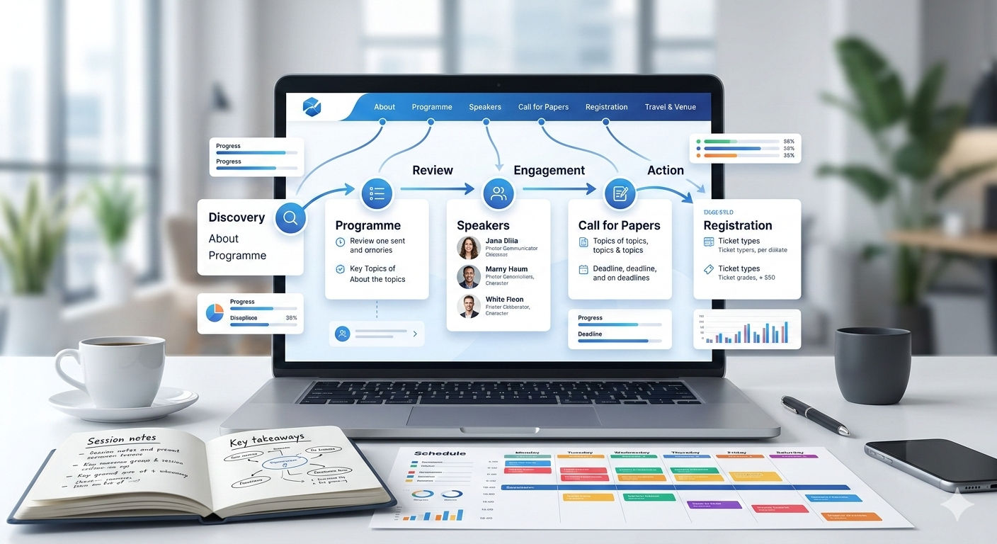
Best Practice 5: Navigation Should Reflect the Attendee's Questions, Not the Organiser's Structure
The most common navigation failure on conference websites is organising the menu around how the organising committee thinks about the conference rather than how an attendee thinks about whether to come.
Attendee-centred navigation structure:
- About — What is this conference, who runs it, what is its history and reputation
- Programme / Speakers — What will actually happen at the conference, who will speak
- Call for Papers / Submissions — How to submit work, what the deadlines are, what the process looks like
- Registration — How to register, what it costs, what is included
- Travel & Venue — Where the conference is, how to get there, where to stay
- Contact — Who to reach out to with questions
This structure answers the questions an attendee is actually asking, in roughly the order they ask them. A navigation organised around "Committees," "Proceedings," "Sponsors," and "Technical Sessions" may accurately reflect the conference's organisational structure but forces attendees to map their questions onto an unfamiliar taxonomy — a small friction that compounds across thousands of visits.
Key Insight: A usability study by NN/g on professional event websites found that attendees consistently struggled to find registration information on sites where the registration pathway was not directly accessible from the homepage requiring two or more clicks from the hero section. The study recommended placing a "Register" button in the primary navigation at all times once registration is open, regardless of where it appeared elsewhere on the page. For academic conference websites, where registration timing relative to abstract submission deadlines creates complex navigation priorities, this single persistent navigation element resolved the most common wayfinding failure.
Best Practice 6: Post-Event Content Extends the Website's Value
A conference website that goes dark immediately after the event or that is simply abandoned misses the significant long-term value of the academic community it has assembled. Post-event content extends the site's usefulness, supports the reputation of future editions, and improves search engine visibility.
High-value post-event content:
- Proceedings and accepted papers list — with links to full papers where available. This is often the most-searched content on academic conference websites after the event concludes, and it builds inbound search visibility for years.
- Presentation recordings or slides — where speakers have given permission. These have long tails of viewing and citation after the event.
- Photo galleries — from the conference itself. These serve as social proof for future editions and give past attendees something to share.
- A brief summary post — key themes, attendance numbers, memorable discussions — that crystallises the conference's intellectual contribution for those who did not attend.
Is Your Conference Website Doing Enough to Convert Interest Into Registrations?
Most conference websites are built for the organising committee, not for the attendee who is trying to decide whether to come. A systematic review of your conference website against these best practices hero section clarity, attendee decision journey structure, important dates visibility, keynote conversion content will identify the specific changes that will most improve registration conversion.
→ Request a conference website design and conversion review
Frequently Asked Questions
When should a conference website go live?
The website should be live before the Call for Papers is distributed, which is typically six to twelve months before the conference itself for academic conferences. A minimal site with the conference name, dates, location, theme, and a clear indication that the CFP is forthcoming is sufficient at this early stage. Waiting until the programme is fully formed before launching means missing the six to twelve month window during which researchers are planning their conference submission schedules.
Should a conference website be built new each year or maintained as a continuing site?
For recurring conferences, a maintained continuing site where each edition has its own subdirectory or subdomain (conference.org/2026, 2026.conference.org) under the same root domain is strongly preferable to a new site each year. The continuing site accumulates domain authority, search ranking, and backlink equity over time. A new site every year starts from zero each time, which means the site ranks poorly in search results at exactly the point early in the promotion cycle when it most needs to be visible.
What is the most important technical requirement for a conference website?
Fast loading time and reliable uptime, particularly during the submission and registration deadline periods when traffic spikes significantly. A conference website that goes down during the final hours before a paper submission deadline generates significant negative sentiment and support burden. Use reliable hosting with automatic scaling, and test load performance during peak traffic simulations before critical deadline periods.
How detailed should the Call for Papers page be?
Detailed enough that a researcher can determine whether their work fits the scope without needing to email the organisers. This means clear topical scope, explicit format requirements (page length, anonymisation requirements, proceedings format), explicit deadline information, and a clear explanation of the review process (double-blind, single-blind, number of reviewers, notification timeline). Vague CFP pages generate a disproportionate volume of scope-checking emails that consume organiser time.
Should a conference website have social media integration?
Yes, specifically a conference hashtag prominently displayed and linked to the most active platform for the conference's community. For academic computing conferences, Twitter/X has historically been the dominant conference social channel. For medical and clinical conferences, LinkedIn is often more appropriate. The website should make it trivially easy for attendees and speakers to find and use the official conference hashtag, and consider embedding a curated (not live-feed) selection of social posts from past editions as social proof.
.gif)


