

Initial Summary
University faculty pages exist in a state of permanent compromise: they must serve department administrators who need standardized information, prospective students evaluating whether to work with a professor, peer researchers assessing collaboration potential, and the faculty members themselves who want control over their professional presentation. Most university faculty pages fail because they prioritize institutional consistency over individual utility, resulting in templates so rigid that they obscure rather than communicate faculty expertise. The best faculty pages solve this by either working within institutional constraints cleverly or bypassing them entirely with personal websites that actually serve faculty career goals. This analysis examines ten examples that demonstrate what effective faculty pages accomplish in practice and the specific layout and content decisions that make them work.
What Makes a Faculty Page Effective
Before examining specific examples, it's necessary to establish the evaluation criteria, because 'good faculty page' means different things depending on who's using it and what they need to accomplish. A faculty page serves multiple audiences with competing needs, and the most effective pages acknowledge this explicitly rather than pretending a single design can serve all purposes equally.
Audience 1: Prospective graduate students. They need to understand the professor's research clearly enough to determine fit, see evidence of successful student mentoring, and find contact information to initiate conversation. They're evaluating whether this person would be a good advisor for 4-6 years.
Audience 2: Peer researchers. They need to quickly assess research focus, recent publications, and methodological expertise to evaluate collaboration potential or citation relevance. They already speak the field's language and want specificity, not accessibility.
Audience 3: Potential collaborators outside academia. Industry partners, policy makers, or journalists need to understand what the professor knows and whether they can speak credibly on specific topics. They need translation from academic to applied context.
Audience 4: University administrators. They need standardized information for directories, accreditation, and internal reporting. They want consistency, not individuality.
The best faculty pages either elegantly balance these needs or explicitly choose which audiences to prioritize and design accordingly.
Key Insight: The faculty pages that serve professors best are not the ones that look the most professional by institutional standards. They're the pages that make it immediately clear what the professor studies, who should contact them, and what working with them would involve. A plain page with clear information outperforms a beautifully designed page with vague academic language every time.
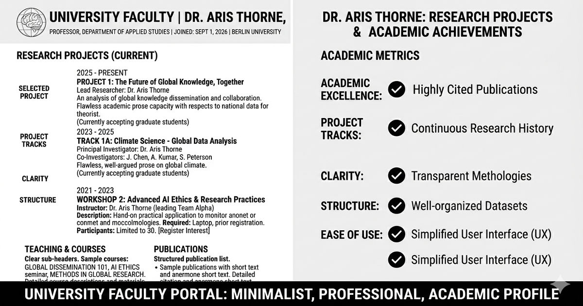
Example 1: Research-Forward Layout with Clear Project Descriptions
The most effective faculty pages for research-active professors place research front and center, with project descriptions that are specific enough to be useful but accessible enough for potential students to understand. This pattern works particularly well in STEM fields where active projects define the lab's identity.
What This Layout Does Well
Research projects listed first: Instead of burying research under 'About' or mixing it with publications, the page opens with 3-5 current research projects, each with a descriptive title, 2-3 sentence explanation, and visual (diagram, photo, or figure from the work).

Project-centric rather than chronological: Instead of listing publications chronologically, research is organized by active themes. Publications appear under the relevant project, showing intellectual continuity rather than isolated papers.
Student opportunities clearly marked: Each project includes a note: 'Currently accepting graduate students' or 'Undergraduate research positions available' or 'No positions available'. This immediately answers the question prospective students actually have.
Why This Works
Prospective graduate students can quickly determine if the professor's research interests align with theirs and whether there are openings. Peer researchers understand the lab's current focus, not just past publications. The page functions as a living research statement rather than a static CV.
Implementation for Your Page
If your research is organized around distinct projects or themes, lead with them. Create a 'Current Research' section above your bio, with each project as a card or subsection. Include visuals that make the work concrete, even if it's just a figure from a recent paper.
Pattern to steal: Project titles should be descriptive enough that a smart undergraduate could understand the topic. 'Developing CRISPR tools for epigenetic modification' is better than 'Project 1: Gene editing'. Specificity builds credibility.
Example 2: Bio-First Layout for Interdisciplinary or Public-Facing Scholars
Some faculty pages lead with a substantial bio section that establishes intellectual trajectory and positions the professor in broader conversations beyond their narrow specialty. This works well for scholars who work across disciplines, engage with policy, or whose work addresses questions that matter outside academia.
What This Layout Does Well
Narrative bio, not CV prose: The bio is 3-4 paragraphs written in first person or engaging third person, explaining what questions drive the work, how different research streams connect, and why this work matters beyond academic audiences.
Context before credentials: Instead of opening with institutional affiliation and degrees, the page opens with a statement of intellectual mission. Credentials appear further down or in a sidebar.
Media and public engagement highlighted: If the professor writes for general audiences, appears in media, or engages in public scholarship, this is prominently featured rather than buried under 'Other Activities'.
Why This Works
For interdisciplinary scholars, explaining how disparate research threads connect is essential. For public intellectuals, demonstrating engagement beyond academic publishing establishes credibility with journalists and policy makers. The narrative bio does intellectual work that a publications list cannot.
When to Use This Layout
Choose bio-first layout if: Your work spans multiple disciplines and needs integration, You regularly engage with non-academic audiences, Your intellectual trajectory itself is interesting (e.g., moved between fields, brings unusual background to current work), or Your research addresses questions that matter to policy or public discourse.
Pattern to steal: Write your bio to answer 'What questions drive your work?' rather than 'Where have you worked?' The former is interesting; the latter is just CV recitation.
Key Insight: Publications lists organized chronologically tell visitors almost nothing about a research program's intellectual coherence. The best faculty pages group publications thematically, by project, or by research question, revealing how individual papers contribute to larger intellectual agendas. A visitor should be able to understand your research program's logic from how publications are organized, not just from reading all the abstracts.
Example 3: Minimalist Layout with Maximum Information Density
Some of the most effective faculty pages are visually simple but informationally rich. These pages strip away decorative elements and focus entirely on making information scannable and accessible. This approach works particularly well for senior faculty with extensive publication records.
What This Layout Does Well
Clear typography hierarchy: Section headings, subsection headings, and body text are clearly differentiated through size and weight, not color or decoration. Information structure is immediately apparent.
No wasted space: Every section contains substantive information. There are no stock photos, decorative elements, or placeholder content. If a section doesn't have real content, it doesn't exist.
Scannable publications list: Publications are formatted consistently with author names, year, title, and venue clearly distinguished. Bold text, italics, or spacing makes each element immediately identifiable without reading every word.
Why This Works
Senior faculty often have 50+ publications, extensive teaching history, and multiple service commitments. Visual simplicity prevents the page from becoming overwhelming. Clear hierarchy lets visitors find specific information (recent papers, contact info, course offerings) without reading everything.
Pattern to steal: Use whitespace and typography to create hierarchy, not colored boxes or decorative dividers. The goal is scanning efficiency, not visual interest.
Example 4: Teaching Portfolio Layout for Education-Focused Faculty
Faculty at teaching-focused institutions or those with significant teaching awards and innovation need pages that showcase pedagogical work as seriously as research. This layout makes teaching central rather than treating it as a secondary 'service' category.
What This Layout Does Well
Teaching philosophy prominently placed: A brief (200-300 word) teaching philosophy appears early on the page, explaining pedagogical approach and what students can expect.
Course materials accessible: Syllabi, assignments, or course websites are linked directly from the faculty page. This demonstrates a pedagogical approach through actual materials rather than descriptions.
Student outcomes highlighted: If appropriate for the field, the page includes information about student success: 'Former students now at [institutions]', teaching awards, or student testimonials (if institutional policy allows).
When to Use This Layout
This layout works when: Teaching is a significant part of your identity and institutional mission, You've won teaching awards or developed innovative courses, You're at a primarily undergraduate institution, or Prospective students are a key audience (they want to know what taking your class would be like).
Pattern to steal: Link to actual course syllabi or assignments rather than just listing course names. Concrete artifacts demonstrate a teaching approach far better than abstract statements about pedagogy.
Example 5: Lab Website Integration (Personal + Group Site)
Faculty who run research labs face a choice: maintain separate personal and lab websites, or integrate them. The most effective integration creates a clear distinction between the professor's individual identity and the lab's collective work while making both easily accessible.
What This Integration Does Well
Two-site strategy with clear linking: The personal faculty page focuses on the professor's bio, publications, and contact info. A prominent link leads to the lab website, which features group members, projects, and lab culture.
Individual vs. collective attribution: The personal page lists publications with all authors properly credited. The lab website emphasizes collaborative projects and team member contributions.
Graduate student recruitment information on lab site: Details about joining the lab, current openings, application process, and what working in the lab entails live on the lab website, not the personal faculty page.
Why This Works
Prospective students get detailed information about lab culture and joining process without cluttering the faculty page. Peer researchers can quickly access the professor's individual work while also seeing group projects. The separation acknowledges that the lab has identity beyond its PI.
Pattern to steal: If you run a lab, maintain both a personal faculty page and a lab website. Link between them prominently. The faculty page represents you; the lab website represents the group.
Example 6: Media-Rich Layout for Applied and Creative Fields
Faculty in architecture, design, art, engineering, or applied sciences need pages that show work visually. These pages use images, videos, or interactive demonstrations as primary content, not decoration.
What This Layout Does Well
Visual portfolio as primary content: Project images, design work, or prototype photos appear prominently, with text explaining context rather than describing what the image shows.
Project case studies: Instead of publication lists, major projects are presented as case studies with problem, approach, solution, and outcome. Visual documentation shows the work at each stage.
High-quality images properly credited: All images include captions with project name, date, collaborators, and photographer credit if applicable. This demonstrates professional standards and proper attribution.
Technical Requirements
Images must be optimized for web (compressed without visible quality loss), load quickly on mobile, and include alt text for accessibility. Pages with 20+ high-resolution images that aren't optimized become unusable.
Pattern to steal: If your work is visual, show it. Text should explain context and significance, not describe what's already visible in the image. Use captions to credit collaborators and provide essential information.
Looking for faculty page inspiration?
Browse examples of effective academic websites across different fields and career stages to see these patterns in action.
→ Explore academic website examples
Example 7: Publication-Centric Layout with Smart Categorization
For faculty with extensive publication records, organizing papers effectively becomes crucial. The best publication-centric pages group papers in ways that reveal intellectual structure rather than just listing chronologically.
What This Layout Does Well
Categorization by research theme: Publications are grouped under 3-5 research themes (e.g., 'Computational Methods', 'Cancer Biology', 'Drug Discovery'), with papers listed chronologically within each theme. This shows how individual papers contribute to larger research programs.
Selected vs. complete publications: The page features 10-15 'selected publications' prominently, with a link to complete publication list (CV or Google Scholar). This helps visitors quickly assess research without overwhelming them.
Download links and citation metrics: Each major publication includes a PDF link (where permitted) and citation count or impact metrics, helping visitors assess influence.
Why This Works
Thematic organization reveals intellectual coherence that chronological listing obscures. A visitor can quickly understand the faculty member's major research areas and see the progression of work in each area. Selected publications prevent overwhelming visitors while still showcasing breadth.
Pattern to steal: If you have 20+ publications, group them thematically. Create categories that reflect your actual research program structure, not departmental classifications or arbitrary groupings.
Example 8: Contact-Forward Layout for Collaborative Faculty
Some faculty pages prioritize making contact easy because the professor actively seeks collaborations, consulting opportunities, or media engagement. These pages make 'how to reach me' and 'what I can help with' immediately clear.
What This Layout Does Well
Multiple contact pathways visible: Email, office hours, scheduling link (if used), and social media are all accessible from the homepage, not buried in a contact page.
Expertise explicitly stated: A section titled 'I can help with' or 'Areas of expertise' lists specific topics the professor can speak about or collaborate on. This is particularly valuable for media contacts or industry partnerships.
Response time expectations set: The page includes a note like 'I typically respond to emails within 48 hours' or 'For time-sensitive requests, email with URGENT in subject line'. This manages expectations and filters contact appropriately.
When to Use This Layout
This layout works when: You actively seek collaborations or consulting work, You engage regularly with media or policy makers, You want to be contactable by industry partners, or Your work has applied implications and you want to connect with practitioners.
Pattern to steal: List your areas of expertise in terms non-academics would search for. 'Climate change adaptation strategies for coastal cities' is more useful than 'urban environmental policy' for someone looking for an expert to consult.
Example 9: Graduate Student Recruitment-Focused Layout
Faculty actively recruiting graduate students need pages that answer the specific questions prospective students have about joining the lab, funding, expectations, and what working together would involve.
What This Layout Does Well
Prospective students section: A dedicated section (or separate page) titled 'Join My Lab' or 'Work With Me' that addresses: Current openings (yes/no and when next positions available), Funding (full funding guaranteed, external funding required, or mixed), Research areas seeking students, Application process and timeline.
Current student information: Names and research topics of current graduate students, showing lab size and research diversity. If appropriate, brief profiles or photos of students.
Former student outcomes: Where former students are now (postdoc positions, industry jobs, faculty positions). This demonstrates successful mentoring and helps prospective students evaluate career preparation.
Critical Information to Include
Prospective students need to know: Are you taking students this year?, What research projects have openings?, What preparation or background is expected?, How should they contact you (email with CV? Through department application only?).
Pattern to steal: Update your student recruitment information every admissions cycle. Nothing is more frustrating for prospective students than outdated information about whether you're accepting students.
Example 10: Timeline/CV Hybrid Layout for Career Narrative
Some faculty pages present career progression as a narrative timeline rather than a static CV. This works well when the trajectory itself is interesting or demonstrates unusual expertise combinations.
What This Layout Does Well
Visual timeline: Career milestones (degrees, positions, major publications or grants) are displayed chronologically with dates clearly marked. This shows career progression at a glance.
Narrative connections: Brief text explains how each position or project led to the next, revealing intellectual development rather than just listing accomplishments.
Branching expertise: If the professor moves between fields or combines unusual backgrounds, the timeline shows how these threads integrate. For example, an engineering PhD followed by medical school followed by a faculty position in biomedical engineering.
When This Works
This layout is effective when: Your career path is non-linear and the trajectory itself demonstrates valuable perspective, You work at the intersection of multiple fields, Your background combines unusual elements (industry + academia, multiple disciplines, international experience), or Understanding how you got to current research helps explain why your perspective is unique.
Pattern to steal: If you use timeline layout, include narrative text explaining connections between stages. The visual timeline shows the path; the narrative explains why that path matters.
Key Insight: The faculty pages that generate the most collaboration opportunities, student inquiries, and professional connections are not the ones with the most impressive credentials. They're the pages that make it immediately clear what the professor is interested in, what they're working on now, and how someone might productively engage with them. Accessibility beats prestige every time.
Essential Content Every Faculty Page Needs
Regardless of layout choice, certain information must appear on every faculty page. These are non-negotiable elements that visitors expect and will leave frustrated if they can't find it.
1. Current Institutional Affiliation
Full title, department, and institution. Include rank (Assistant/Associate/Full Professor) as this signals career stage and potential availability for collaboration or moves.
2. Research Description
2-4 paragraphs (or equivalent organized content) explaining: What you study, Why it matters, What methods or approaches you use, What major questions or problems you're addressing.
3. Contact Information
At minimum: institutional email address and office location. Consider Office hours (if you hold them), Phone number (optional), Links to academic profiles (Google Scholar, ORCID, ResearchGate).
4. Publications or Research Output
Either: Selected publications list on the page, Link to full publication list (CV, Google Scholar, or personal website), or Both (selected on page, link to complete list).
5. CV or Professional History
Either: Embedded CV on the page, Downloadable PDF CV, or Link to personal website with detailed CV. At minimum, education (PhD institution and year) and current position should be visible without downloading anything.
Technical Implementation: Making Good Design Actually Work
The examples above demonstrate content and layout patterns, but implementation determines whether these patterns actually function for visitors. Here are the technical requirements that separate good designs from broken ones.
Mobile Responsiveness (Non-Negotiable)
More than 60% of academic website traffic comes from mobile devices. Your faculty page must work on phones. This means: Text is readable without zooming (16px minimum font size), Navigation works with thumb taps, not precise mouse clicks, Images resize appropriately, PDFs are accessible (or alternative formats provided), Complex layouts simplify appropriately on small screens.
Fast Loading (Especially on Mobile Networks)
Pages should load in under 3 seconds on 4G mobile networks. This requires: Compressed images (aim for under 200KB per image), Minimal JavaScript (avoid heavy libraries if possible), Clean code without bloat.
Accessibility Standards
Faculty pages should meet basic WCAG 2.0 AA standards: Alt text for all images, Sufficient color contrast for text, Keyboard navigation support, Semantic HTML structure, Descriptive link text (not 'click here').
Working Links
Test every link quarterly: Publication PDFs still download?Personal website still exists?Email addresses still work?Social media profiles still active?.
Ready to build a faculty page that actually works?
We specialize in creating academic websites that balance institutional requirements with individual faculty needs. Our faculty pages are designed for clarity, built for mobile, and optimized for the audiences that matter most to your career.
→ Get a free consultation on your faculty page
Frequently Asked Questions
Should I use my institutional faculty page or create a personal website?
Ideally, both. Maintain your institutional page because that's where people find you through university directories and department websites. But also create a personal website that you control, where you can present information exactly as you want without institutional constraints. Link between them prominently. The institutional page establishes affiliation; the personal site establishes identity.
How much control do I have over my institutional faculty page?
This varies dramatically by institution. Some universities provide templates with limited customization (you can add text and images within predefined sections). Others give faculty full control through content management systems. Some provide only basic directory listings. Check with your department about what you can edit. If institutional constraints are severe, invest effort in your personal website instead.
What should I do if my institution requires an outdated or limiting template?
Work within the template as best you can: write clear research descriptions, link to external resources (personal website, Google Scholar), and keep information current. Then create a personal website where you have full control. Many faculty find their personal sites become their primary professional presence, with institutional pages serving mainly as directory entries that link to the real content.
How often should I update my faculty page?
Update your faculty page whenever major changes occur: new publications, grants, positions, or awards. Review the entire page at least twice per year (beginning and end of academic year) to ensure accuracy. Pay particular attention to: Contact information (especially if you move offices), Graduate student recruitment status (are you accepting students?), Recent publications, Teaching assignments (if listed).
Should I include personal information or keep it strictly professional?
Brief personal information can humanize your page and help students or collaborators connect with you. Appropriate personal content includes: Academic origin story (what drew you to your field), Brief mention of outside interests if relevant to your intellectual work, or Pronouns and name pronunciation if helpful. Avoid: Extensive personal biography, Family photos or information about children, Political affiliations unless directly relevant to research, or Anything you wouldn't want a tenure committee or journalist to quote.
What's the difference between a faculty page and a faculty profile?
These terms are often used interchangeably, but generally: A faculty page is a full webpage (or mini-site) with multiple sections, detailed information, and often multiple sub-pages. A faculty profile is a shorter, template-based listing in a department directory with standardized fields. Many institutions provide both: a brief profile in the directory that links to a more detailed faculty page. Invest most effort in whichever has more visibility and flexibility.
.gif)


