

Initial Summary
NUS research lab websites are among the most-evaluated pages by prospective PhD students and industry collaborators in Southeast Asia. A great lab site doesn't just list publications it communicates mission, culture, and momentum in seconds. This article reviews six verified, live NUS lab websites and extracts the design and content patterns that make each one work.
If you've ever landed on a university research lab website and immediately felt lost walls of jargon, broken links, a copyright footer from 2014 you know how bad academic web presence can be. But the National University of Singapore is home to some genuinely brilliant lab websites that buck this trend. They're clear, current, and actually help researchers, students, and collaborators understand the work.
This article walks through real, live NUS research lab websites, unpacks what each one does well, and draws out the design and content patterns that make them work. Whether you're building your own lab site or just looking for inspiration, these are the benchmarks worth studying.
Why NUS Lab Websites Matter More Than Ever
Research labs compete globally for the best PhD candidates, postdocs, industry partners, and grants. Your lab website is often the first and sometimes only impression you make on a shortlisted candidate sitting in Berlin or Boston deciding between three offers. A polished, informative lab site signals that your group is active, organised, and worth joining.
In Singapore's competitive R&D landscape, where NUS competes alongside NTU, A*STAR, and increasingly top Asian institutions, a strong lab website is a recruiting and reputational asset, not a nice-to-have.
Key Insight: Your lab website is doing recruiting work 24/7, whether you've designed it for that purpose or not.
1. NUS Soft Robotics Lab

Designed by SitesGo
The Soft Robotics Lab website is a strong example of a modern research-group presentation built with a professional design system rather than a default university template. The lab focuses on adaptive robots made from soft materials, spanning bio-inspired robotics, assistive robotics, and intelligent sensing.
Why it works
- Clear research explanation: The homepage immediately explains soft robotics and why it matters to humans
- Human-impact framing: Assistive robotics for elderly care makes the work understandable beyond engineers
- Strong collaboration signals: Logos from multiple universities and institutes build credibility
- Active lab feel: News posts show ongoing projects and momentum
- Simple academic navigation: Research, Publications, People, News nothing cluttered
The site reads less like a repository and more like a research organisation.
Pattern to steal: Explain the field before the papers. A visitor should understand why your research exists before seeing your publications.
2. AESB Research Group
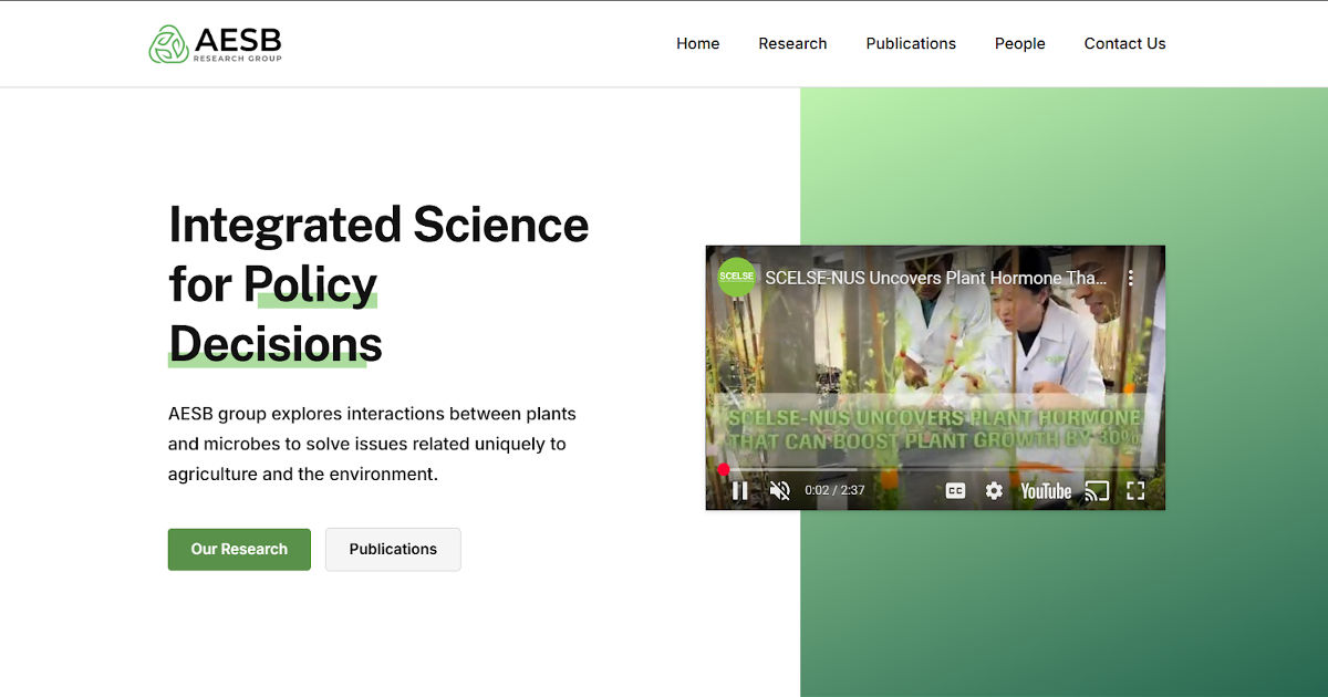
Designed by SitesGo
Another notable aspect is how the site balances career legacy + ongoing activity. It documents a long research history while still highlighting current collaborations, projects, and students, making the lab appear both established and active at the same time.
Why it works
- Story-driven homepage (PI → research → impact)
- Industry logos create authority instantly
- Professional faculty profile section
- Research translated into societal relevance (environment & agriculture)
Standout difference from typical university sites
It feels like a professional organization rather than a static department page.
Pattern to steal: Treat the lab like a brand → PI credibility + impact narrative + collaborators above the fold.
3. MathEXLab - NUS Singapore
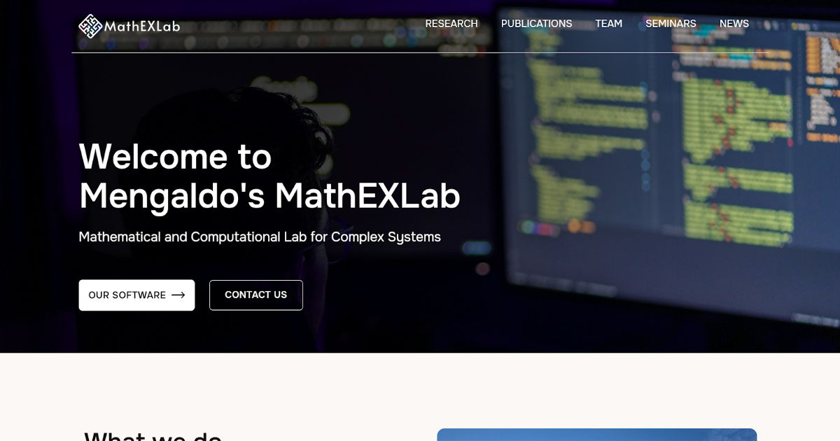
Designed by SitesGo
Prof. Gianmarco Mengaldo's MathEXLab at NUS is a masterclass in turning abstract, highly technical research into a compelling web presence. The lab works on mathematical and computational approaches for complex systems not the easiest sell to a non-specialist, but the site handles it with elegance.
- Opening with a Galileo quote: Rather than a generic mission statement, the homepage opens with a Galileo quotation about mathematics being the language of the universe. It immediately signals intellectual ambition and frames the lab's identity without a single jargon-heavy sentence.
- Open-source commitment featured upfront: A direct link to the lab's GitHub is on the homepage a powerful credibility signal for computational researchers who want to verify that the science is reproducible.
- Collaborator wall: A visual row of partner institution logos (NVIDIA, ECMWF, Cambridge, Brown, Columbia, and many more) communicates the lab's reach and funding pedigree at a glance.
- Media and news integration: An interview with the Italian Embassy, a Nature publication highlight, and conference attendance posts are all woven into the homepage news section showing a lab that's active and internationally connected.
Pattern to steal: If your work is heavily technical, lead with a philosophical or narrative frame before diving into methodology. It broadens your audience without dumbing down your science.
4. Plasticell – Translating Science into a Trustworthy Biotech Brand
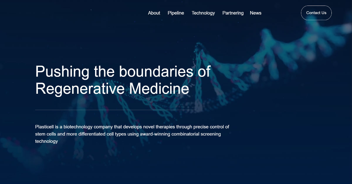
What works:
- Instant scientific positioning: The hero image and headline communicate field and purpose within seconds
- Audience-segmented navigation: Investors, collaborators, and researchers each have clear paths (pipeline vs technology vs partnering)
- Credibility through clarity: Rather than dense publications, the site explains the platform and applications in understandable terms
- Corporate-research balance: Feels both like a research lab and a commercial organization important for biotech trust
Pattern to steal: For research labs and academic groups moving toward industry collaboration, clarity beats complexity. A visitor should understand what problem you solve before they learn how science works. Position the mission first, the mechanism second, credibility follows comprehension.
5. CQT - Making Fundamental Physics Legible to the World
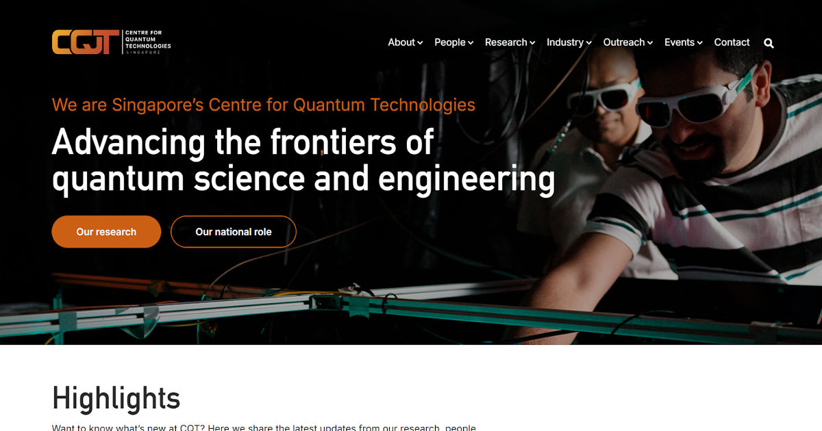
The Centre for Quantum Technologies (CQT) website demonstrates how a deep-theory research institute can communicate advanced science without alienating non-experts. Instead of presenting quantum mechanics as an impenetrable academic subject, the homepage frames the lab around big ideas of quantum computing, communication, and sensing and explains why they matter for future technology and society. Clear visuals, structured research themes, and accessible explanations allow students, collaborators, and industry partners to quickly orient themselves.
What works:
Immediate research framing:
The homepage states the field (quantum technologies) and its future impact before diving into technical detail.
Audience-layered navigation:
Students, researchers, media, and partners can each find relevant content (research areas, education, outreach, news) without navigating academic hierarchy.
Conceptual explanations over jargon:
Complex topics like quantum information and entanglement are introduced through ideas and applications rather than equations.
Institutional credibility signals:
Affiliations, publications, and active projects reinforce authority while remaining readable.
Pattern to steal:
For fundamental science fields, start with the implications before mathematics.
Visitors don’t need to understand the physics to understand its importance once the purpose is clear, they’re willing to engage with the complexity.
Want to know which of these patterns your lab is missing?
We’ll compare your current lab page against proven research-group structures and highlight the gaps.
The Design Patterns That Separate Great NUS Lab Websites
Pattern 1: Evidence Over Claims
Weak lab sites say 'we do world-class research.' Strong lab sites show specific awards, named publications, recent conference presentations, and funded projects. Evidence builds trust; claims don't.
Pattern 2: People Are the Product
The best lab websites understand that people are what prospective PhD students are really evaluating. Photo-rich team pages, welcome posts for new members, and alumni success stories all humanise the research group.
Pattern 3: Fresh Content Signals Life
A lab website with news from 2021 signals that the lab may be dormant or that it doesn't care about communication. Even minimal updates: a new paper, a conference talk, a new student demonstrates ongoing activity. Quarterly updates are the minimum; monthly is ideal.
Pattern 4: Mobile Optimisation Is Non-Negotiable
Prospective students browse on phones. Researchers check lab sites during conferences on tablets. Lab websites that don't work well on mobile immediately feel dated and under-resourced.
Key Insight: The lab website isn't just a portfolio, it's a recruiting tool, a trust signal, and a reputation asset. Treat it accordingly.
Build a research lab website that recruits for you
SitesGo builds research lab websites designed to attract top PhD candidates, industry partners, and collaborators with the clarity and credibility your work deserves.
Frequently Asked Questions
How important is it for NUS research labs to have their own website rather than just a department page?
Having a dedicated lab website is significantly more effective than relying solely on a department directory listing. Department pages typically display minimal information in a standardized format, offer no control over content or updates, and rank poorly for the specific research keywords prospective students search. A dedicated lab site lets you control your narrative, update immediately when new research or team members arrive, and create a distinct brand identity that attracts the right candidates and collaborators.
What's the biggest mistake NUS research labs make with their websites?
The single most common and damaging mistake is letting the site go stale. A lab website with news from two or three years ago actively signals to prospective students that the lab may be winding down or doesn't value communication. Even a 30-minute quarterly update to add a new paper, welcome a new student, or note a conference presentation keeps the site feeling alive. The second biggest mistake is writing exclusively for an expert audience, jargon-heavy descriptions repel the broad range of people who might want to engage with your research.
How do I get a subdomain like mylab.comp.nus.edu.sg?
Subdomain allocation is managed by the relevant school or department IT team. For NUS Computing labs, this typically requires a faculty member submitting a request through the School of Computing IT helpdesk. Alternatively, registering a custom domain (mylabnus.com) gives you full control without navigating institutional IT, and is often faster to set up. Custom domains also travel with you if you move institutions.
Should a research lab website be designed for prospective students or for peer researchers?
Both, but design for prospective students first. Peer researchers are sophisticated enough to find and evaluate your work through Google Scholar, ResearchGate, and publication databases. Prospective students need clear, accessible explanations of your research direction, lab culture, and what it's like to work with you. If a bright undergraduate who hasn't yet specialised can understand what your lab does and why it matters, peer researchers will find it even clearer. The reverse is rarely true.
How long does it take to build a good research lab website from scratch?
A solid, functional lab website can be built in one to two weeks of part-time effort using modern platforms like Squarespace, Wix, or a Hugo/Jekyll static site template. The actual build is usually less than 10 hours; the majority of time goes into writing clear research descriptions, gathering team photos, and organising publications. Starting with a content outline before choosing a platform saves significant time.
.gif)


