

Initial Summary
Academic branding isn't about ego, it's about making your research findable, your expertise legible, and your contributions visible to the people who need them. This article presents ten verified, live examples of researchers who do this exceptionally well, drawn from global institutions. Each includes a concrete branding lesson you can apply today.
There's a widespread myth in academia that personal branding is somehow self-promotional or beneath the dignity of serious scholarship. Let's put that to rest immediately. Academic branding isn't about ego, it's about making your research findable, your expertise legible, and your contributions visible to the people who need them.
The researchers who do this best don't feel like influencers. They feel like trusted colleagues. Their websites are clear, their professional presence is consistent, and their work reaches people far beyond their immediate institution. Here are ten of the best academic branding examples verified, live websites you can screenshot and study.
What Academic Branding Actually Means
Academic branding is the sum total of how a researcher presents themselves across all digital touchpoints: their personal website, Google Scholar profile, ORCID, social media presence, and how they're described on institutional pages. Great academic branding creates a consistent, coherent answer to the question: 'Who is this person and why should I trust their expertise?'
It's distinct from self-promotion in an important way: self-promotion pushes credentials at people. Academic branding creates the conditions for people to discover, understand, and engage with your work on their own terms. The best branding feels effortless to the visitor; information appears exactly when and where they need it.
Key Insight: Academic branding is not marketing, it is accessibility. If people cannot find your work, your work cannot influence the field.
1. MathEXLab - Making Abstract Science Tangible Through Purpose
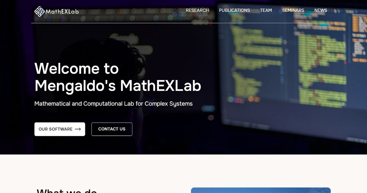
Designed and developed by SitesGo
MathEXLab’s website tackles a difficult communication problem: mathematics and complex systems research are inherently abstract. Instead of presenting equations or dense theory first, the homepage explains what math helps predict climate extremes, earthquakes, and real-world dynamic systems grounding advanced computation in practical impact.
The lab positions mathematics as a universal language connecting disciplines, and reinforces this with open-source software, interdisciplinary modelling, and real-world forecasting applications.
This turns what could feel like theoretical research into applied problem-solving.
What works:
- Impact-anchored explanation: Real-world problems appear before technical methods
- Interdisciplinary identity: Math framed as a bridge across fields
- Open science credibility: Public code repositories signal transparency
Research themes organized by applications: Forecasting and prediction instead of mathematical subfields
Branding lesson:
For theoretical fields, don’t try to simplify the theory and anchor it to consequences.
People understand prediction before they understand equations.
2. Lisa Tan – NUS Singapore

Designed and developed by SitesGo
Lisa X. Tang’s personal website is a modern, narrative-driven professor site that presents her academic identity as a cohesive professional profile rather than a static CV. An SMU faculty member whose work spans business, consumer behaviour, and decision-making research, the site immediately introduces who she is, what she studies, and why it matters in clear, human language. The layout feels closer to a professional portfolio than a university page, making it approachable to students, collaborators, and industry audiences alike.
Why it works:
Custom branded domain: lisaxtang.com is memorable, professional, and independent of any institutional subdomain. It reinforces personal academic identity and remains portable across career stages.
Clear personal positioning: The homepage opens with a concise research introduction written for non-specialists, allowing visitors to understand her expertise within seconds rather than reading dense academic terminology.
People-first presentation: A strong professional portrait and short biography appear immediately, humanising the researcher before presenting achievements helpful for prospective students deciding mentorship fit.
Structured credibility signals: Publications, awards, and experience are organised into clean sections instead of long lists, making accomplishments readable rather than overwhelming.
Balanced audience targeting: The site works simultaneously for students, media, and collaborators by combining accessibility with academic rigour a rare balance in faculty websites.
Pattern to steal: Design your homepage like a professional introduction, not a document archive visitors first want to know the person before the papers.
3. Dr. Patrick Manser – Best Portfolio Website Winner 2025
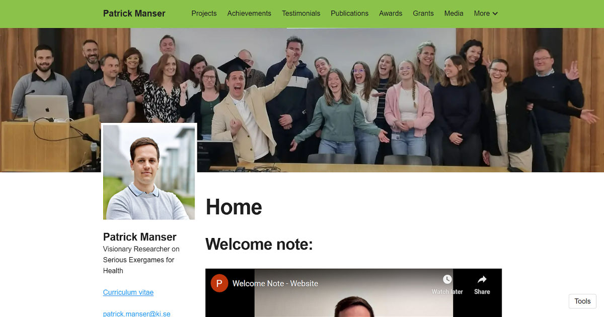
Award Winner: Best Academic Portfolio Website – Best Personal Academic Websites Contest 2025
Judge Ian Li described Manser's website as 'full of information on his research work: publications, courses taught, media, grants, etc. He also provides short descriptions for every item, so you have an introduction to the item.' This is the key branding insight: context transforms a list into a narrative.
Branding lesson: Every publication, grant, and teaching engagement has a brief description explaining its significance. This extra step which takes perhaps 30 minutes per item transforms a dry CV into a compelling professional story. Visitors understand not just what you've done but why it matters.
Key Insight: Context transforms a list into a narrative. Don't just list your work and explain why each item matters. That's the difference between a CV and a brand.
4. Meredith Schmehl – Science Communicator and Neuroscientist, Duke University

Verified via: TheAcademicDesigner.com 2022 contest winners
Meredith Schmehl's website is exceptional for combining rigorous neuroscience research with science communication and advocacy. A PhD Candidate in Neurobiology at Duke, her site opens with a full-width image that immediately signals her values inclusive STEM education before detailing her research.
Branding lesson: Meredith brands herself as three things simultaneously: researcher, science communicator, and STEM advocate. Showing the breadth of your contributions especially if they serve different communities expands your audience without diluting your core credibility.
5. Soft Robotics Lab – Explaining Advanced Research Through Applications

Designed and developed by SitesGo
The Soft Robotics Lab website succeeds by grounding futuristic technology in real-world use cases. Instead of presenting soft robotics as abstract engineering theory, the site frames the research around what the robots do assisting elderly care, adapting to natural environments, and collaborating safely with humans.
The homepage introduces the field clearly and then expands into bio-inspired robots, sensing systems, and assistive technologies, allowing both specialists and non-experts to understand the purpose before the technical depth.
This makes an emerging field feel practical and socially relevant rather than experimental.
What works:
- Application-first explanation: Visitors understand human impact before engineering complexity
- Interdisciplinary clarity: Materials, sensing, and control are unified under a single real-world goal
- Future-oriented narrative: The lab presents robotics as support technology for daily life, not just lab prototypes
- Collaborative credibility: Partner institutions reinforce research maturity
Branding lesson:
For cutting-edge fields, people trust outcomes more than mechanisms. Show where the technology lives in the real world then explain how it works.
Ready to build your own academic brand?
SitesGo builds professor and researcher websites designed to communicate expertise clearly so the right students, collaborators, and opportunities find you.
→ Build my academic brand website
6. Terrer Lab – Framing Research Around Questions, Not Just Topics

Designed and developed by SitesGo
The Terrer Lab website takes a distinctive approach: instead of organizing content around publications or technical domains, it centers the entire site around big scientific questions. The homepage immediately states its purpose in understanding ecosystems and climate and then guides visitors through the problems the lab is trying to solve, like carbon storage, biodiversity feedbacks, and natural climate solutions.
Rather than presenting research as static output, the lab presents it as an ongoing investigation. This makes complex climate science approachable while still maintaining academic rigor.
What works:
- Question-driven structure: Visitors engage with research problems before reading methods
- Clear societal relevance: Climate change impact is obvious from the first screen
- Narrative over archive: Research feels like a story of discovery instead of a list of papers
- Public-facing science: Non-experts can understand why the work matters
Branding lesson: People connect with questions faster than disciplines. Instead of “we study X,” show “we are trying to answer this important problem.”
7. OSON Lab – NTU Singapore

Designed and developed by SitesGo
The OSON (Optical Spectroscopy of Nanomaterials) Lab website shows a powerful academic design principle: demonstrate impact before explanation. Instead of opening with dense theory, the homepage presents measurable proof publication count, team size, and years of activity immediately establishing legitimacy. Only after credibility is established does the visitor explore the research itself.
The design feels structured and calm, mirroring a physics laboratory: precise, quantitative, and trustworthy. The hero image humanizes the lab environment while the metrics communicate scientific maturity.
What works:
- Evidence upfront: Publications, researchers, and longevity instantly signal authority
- Human + data balance: Researcher imagery makes the lab approachable while statistics build trust
- Scannable credibility: Visitors evaluate expertise in seconds without reading paragraphs
- Academic professionalism: Clean layout reflects rigor and stability appropriate for a physical sciences lab
Branding lesson:
In technical disciplines, numbers communicate faster than narratives. Let visitors verify competence before they interpret complexity. Authority should be visible, not inferred.
8. Dr. Tetine Sentell – Research Lab Website, University of Hawaii

Public health research lab website balancing academic research and community health equity outreach, SitesGo, Top 10 Academic Branding Examples from Researchers
Award Winner (tied): Best Research Lab Website Best Personal Academic Websites Contest 2025
Dr. Sentell's lab website tied for the Best Research Lab Website award in 2025. Her work in public health and health equity is reflected in a website that balances academic rigour with genuine accessibility to community stakeholders.
Branding lesson: Community trust is a legitimate form of academic credibility, especially in fields with direct social impact. Sentell's site communicates not just to peer researchers but to the communities her research serves. This dual accessibility academic and community-facing is a powerful differentiator that most lab websites miss entirely.
9. BBML – Biological and Biomimetric Materials Laboratory
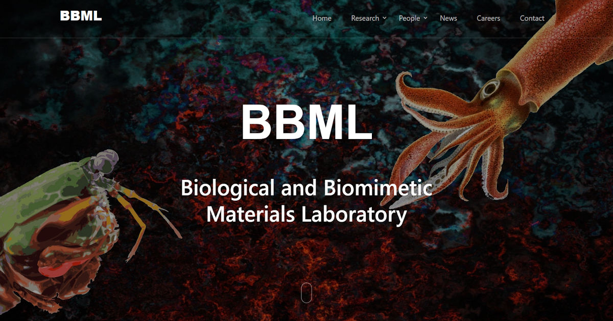
Designed and developed by SitesGo
The Biological and Biomimetic Materials Laboratory (BBML) homepage immediately communicates its research philosophy through imagery before text. Instead of starting with a paragraph of technical description, the site uses striking biological visuals organisms that inspire engineered materials to visually encode the lab’s core idea: learning from nature to design advanced materials. The short, direct title reinforces the concept while the navigation (research, people, careers) supports typical academic audiences.
What works:
- Concept-first communication: Visitors grasp “biomimetic materials inspired by biology” instantly through visuals
- Memorable identity: The distinctive biological imagery creates recall the lab becomes recognizable, not generic
- Aligned aesthetics: The design style matches the research theme, reinforcing credibility and coherence
- Recruitment-friendly structure: Clear sections for research and people guide students and collaborators naturally
Branding lesson: If your research field has a strong visual metaphor (biology, robotics, space, climate, materials), use it. A lab brand should feel like the research area itself. Visual identity isn’t decoration, it's explanation.
10. Plasticell – Translating Science into a Trustworthy Biotech Brand
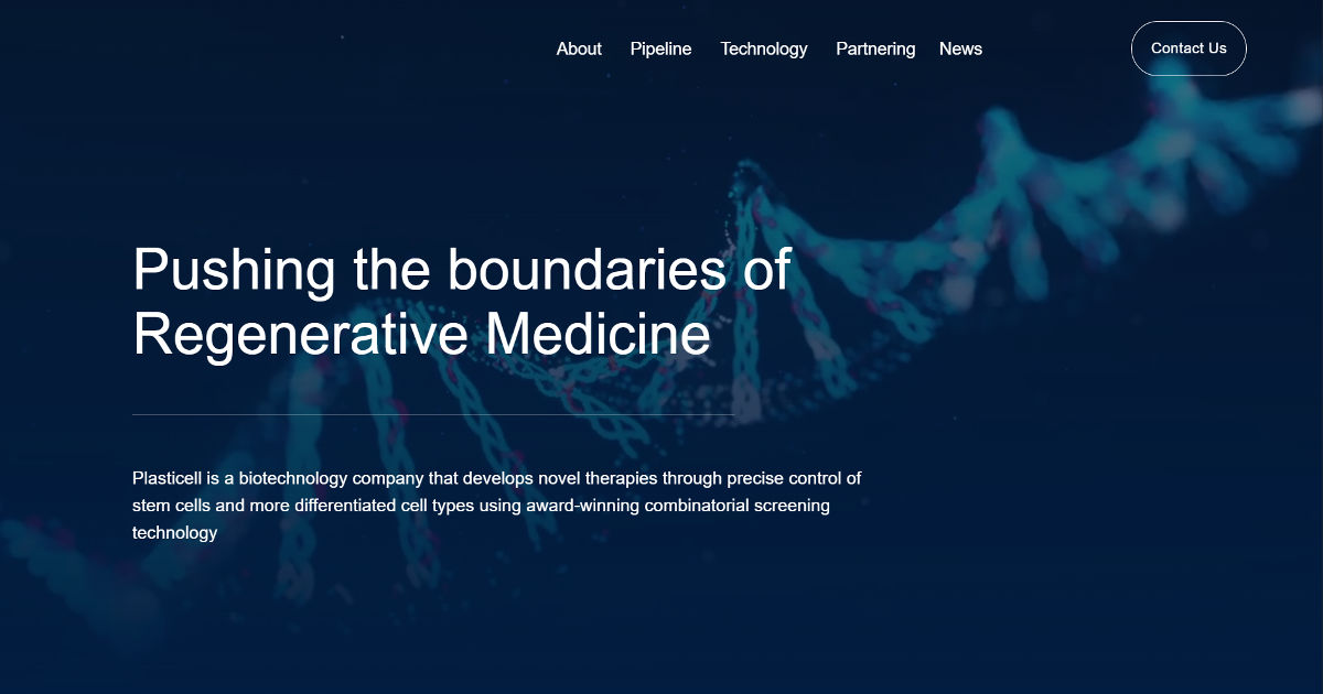
Plasticell’s website shows how a biotech company can communicate complex research without looking like a journal archive. Instead of overwhelming visitors with technical terminology, the homepage leads with a clear mission advancing regenerative medicine supported by clean visuals, minimal text blocks, and intuitive navigation. The lab imagery immediately signals scientific credibility, while the structured sections (pipeline, technology, partnering) guide different audiences to the information they care about.
What works:
- Instant scientific positioning: The hero image and headline communicate field and purpose within seconds
- Audience-segmented navigation: Investors, collaborators, and researchers each have clear paths (pipeline vs technology vs partnering)
- Credibility through clarity: Rather than dense publications, the site explains the platform and applications in understandable terms
- Corporate-research balance: Feels both like a research lab and a commercial organization important for biotech trust
Branding lesson: For research labs and academic groups moving toward industry collaboration, clarity beats complexity. A visitor should understand what problem you solve before they learn how science works. Position the mission first, the mechanism second, credibility follows comprehension.
Curious what your academic profile actually communicates at a glance?
We can point out what a student, collaborator, or journalist immediately infers and what’s missing.
→ Evaluate my academic branding
The Five Patterns Behind Great Academic Branding
1. Consistent Identity Across Platforms
The same photo, bio, and research description appears across your website, Google Scholar, ORCID, LinkedIn, and university profile. Inconsistency, different job titles, outdated photos, contradictory research descriptions confuses AI systems and erodes trust with human visitors.
2. Clarity Before Depth
Every great academic branding example starts simple. Homepage introductions are 2-3 sentences maximum. Only after establishing clarity does depth follow on subsequent pages. The temptation to include everything on the homepage is one of the most common and damaging mistakes.
3. Evidence, Not Claims
Phrases like 'world-class researcher' or 'leading expert' appear in zero top academic branding examples. Instead: specific award names with years, publication titles with venues, grant amounts with funders. Evidence builds trust; adjectives don't.
4. Activity Signals
Dated updates are among the most powerful trust signals on academic websites. A news item from three weeks ago with a specific date says: this person is active, productive, and pays attention. A site with no dates or outdated news says the opposite, regardless of how impressive the CV is.
5. Authentic Visual Identity
The most memorable academic brands reflect genuine personality. Authentic visual choices are more memorable and more trusted than polished-but-generic templates. Consistency and authenticity matter more than uniqueness.
Key Insight: Your academic brand isn't built in a day but it is built one deliberate step at a time. Each of the ten examples above started somewhere modest. What they share isn't a big budget or a design team, it's intentionality about how they show up online.
Build your academic brand with intention
SitesGo builds professor and researcher websites designed to communicate expertise clearly so the right students, collaborators, and opportunities find you.
Build my academic brand website
Frequently Asked Questions
Isn't personal branding inappropriate for academics?
This concern comes from confusing personal branding with self-promotion, and the two are genuinely different. Self-promotion pushes your credentials at people who didn't ask for them. Academic branding creates the conditions for people who are looking for your expertise to find it. A student searching for a mentor in your field, a journalist looking for expert comment, a policymaker seeking research on your topic they all need to find you. Without deliberate branding, they find someone else.
How do I develop a distinctive visual identity without hiring a designer?
A distinctive academic identity doesn't require custom design work. Consistency and authenticity matter more than uniqueness. Choose one professional photo and use it everywhere. Pick one or two colours that appear in your website header and use them consistently. Choose a single clean font. These three decisions alone create more visual coherence than most academic websites have. The key is consistency across platforms: your website, LinkedIn, and institutional profile should all feel like they belong to the same person.
How do I know what my academic brand actually is?
Start with three questions: What research problem am I most known for? What's my distinctive approach or methodology? Who are the students and collaborators I most want to attract? The answers to these three questions form the core of your academic brand. Try writing a single two-sentence description of your research that you'd be comfortable using everywhere. That's your brand statement.
Should my academic brand include personal interests and non-research activities?
Selective personal transparency makes you more memorable and trustworthy, not less professional. Briefly mentioning interests, hobbies, or community involvement humanises you in ways that a list of credentials cannot. Prospective students care enormously about what it's like to work with you as a person, not just your publication record. A sentence or two about what you do outside research adds warmth without compromising scholarly identity.
What's the difference between academic branding and an academic website?
Your academic website is one component of your academic brand typically the most important one, but not the only one. Your brand also includes your Google Scholar profile, ORCID record, how you're described on your university's faculty page, your presence on ResearchGate, and your LinkedIn profile. Great academic branding ensures these components are consistent, current, and collectively tell the same compelling story. A beautiful website undermined by an outdated Google Scholar profile still presents a fragmented brand.
.gif)


